Google Store · with leSHOP
Making the case to switch.
☕ about a 2-minute read
Working inside Google's system.
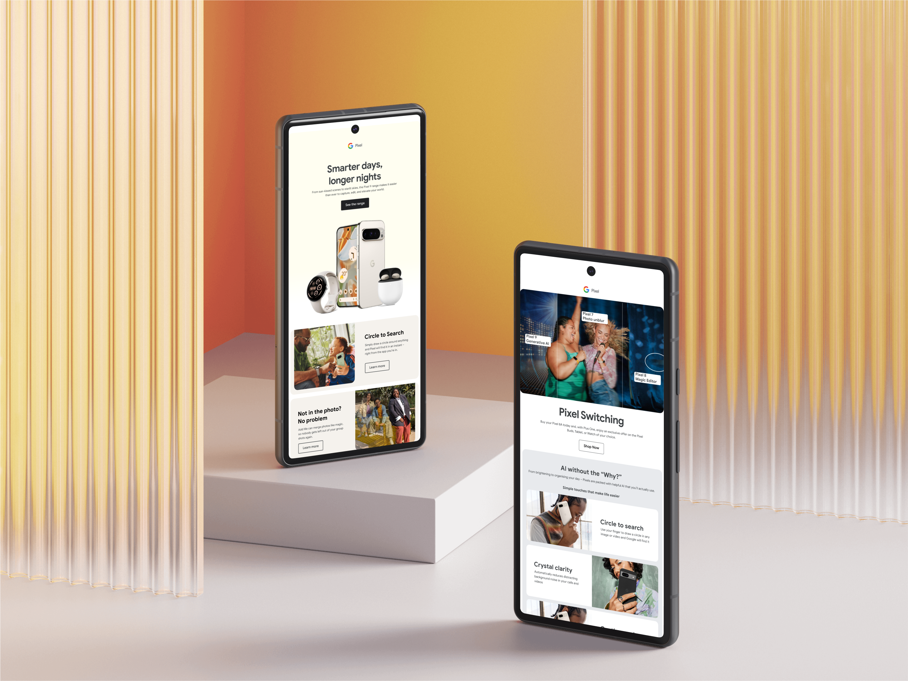
Google's brand guidelines set the boundaries before any layout began. Type, the product colour palette, photography treatment and the rules for the G mark were all fixed, and the brief was never to reinterpret them. The creative direction had to come from structure and sequencing instead: what leads, what gets held back, how a send builds.
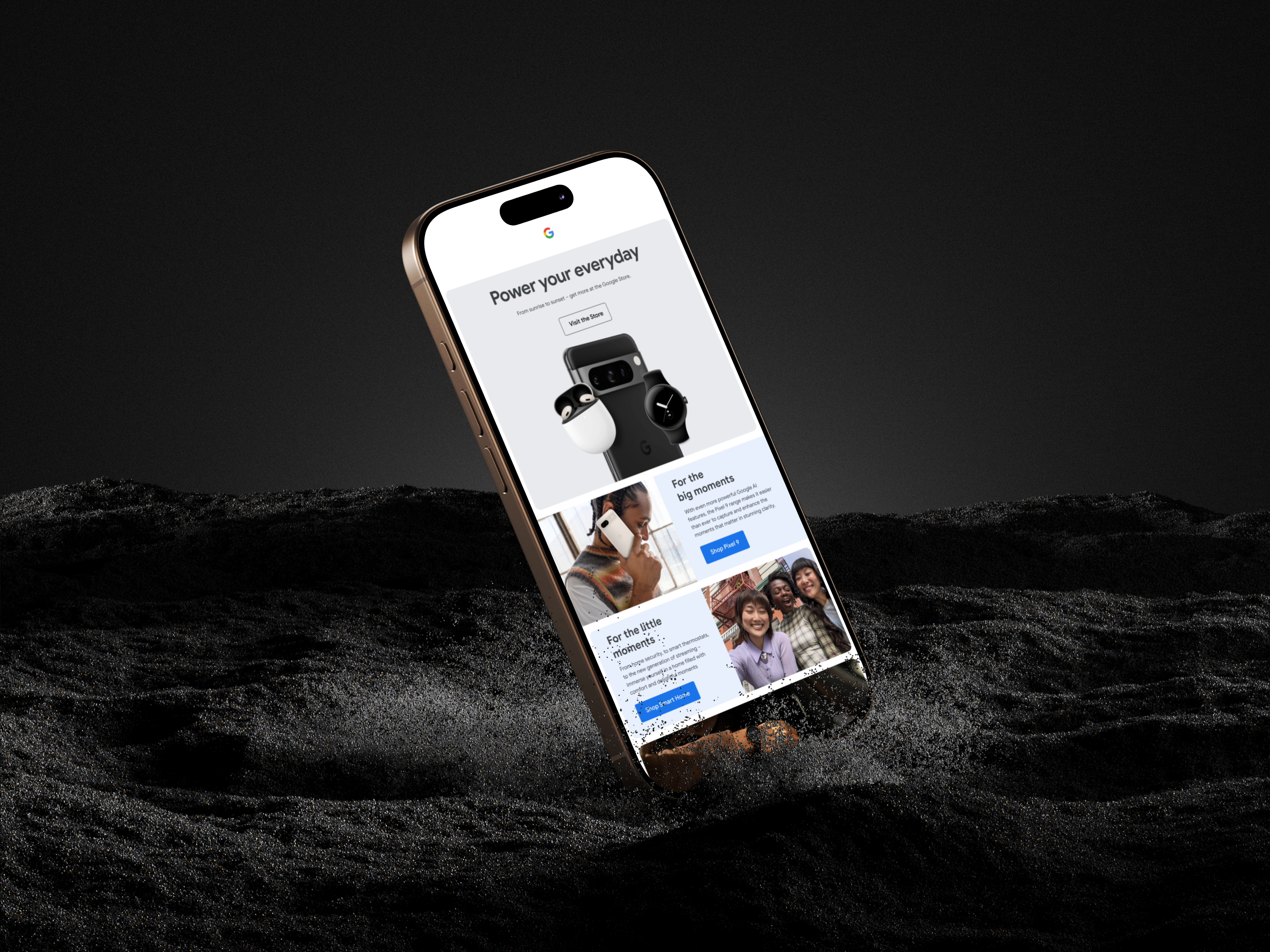
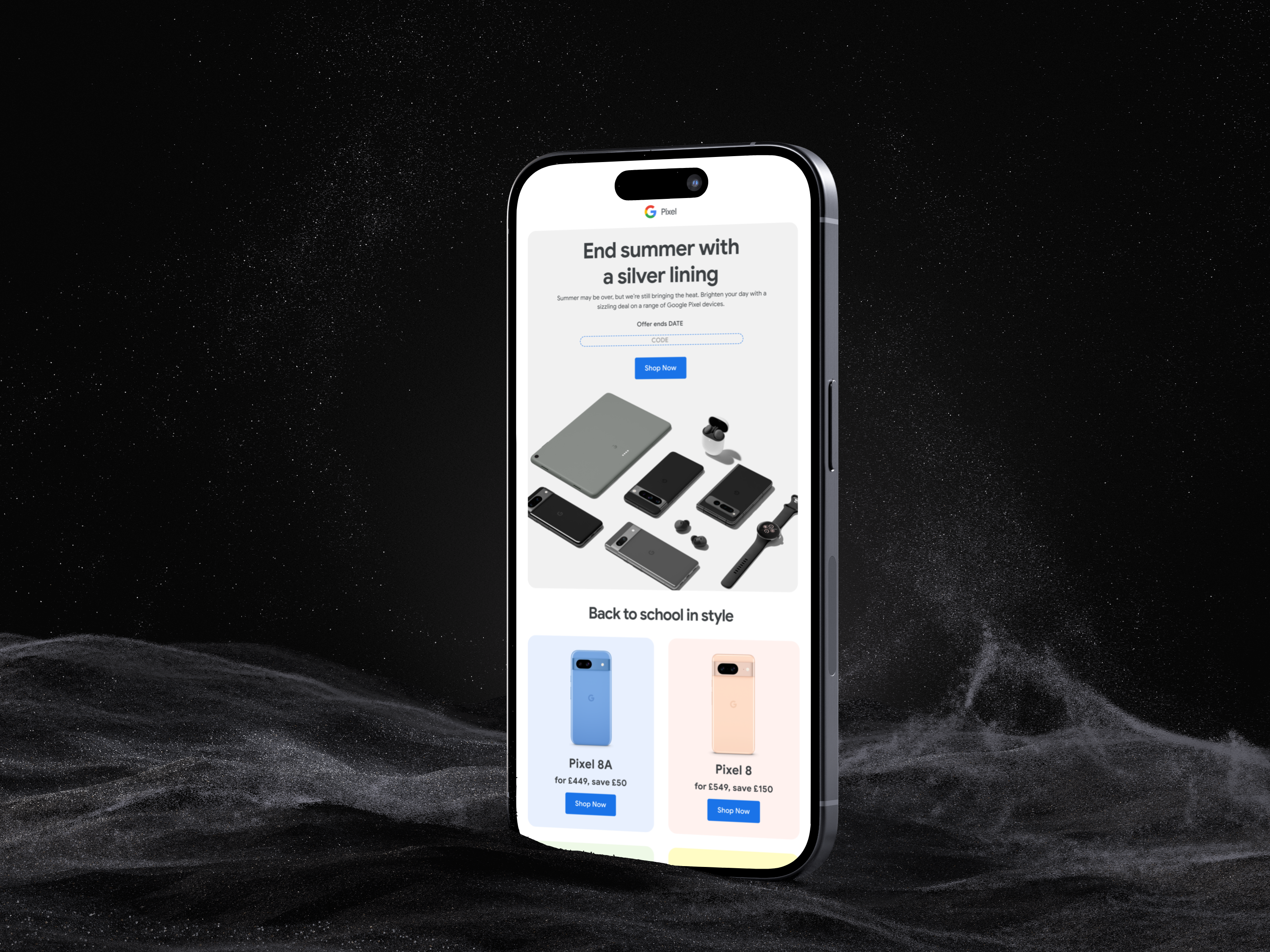
That constraint shaped the switching work more than anything else. There was no room for a hard comparison, so the argument had to be made through demonstration — a feature shown in use, a photograph that only a Pixel camera makes possible, an offer placed at the point where the reader is already convinced. Even the mockups leaned into it, with Pixel campaigns shown running on an iPhone screen.
“The argument had to sit in the product, not the comparison.” ✳
One framework, many jobs.
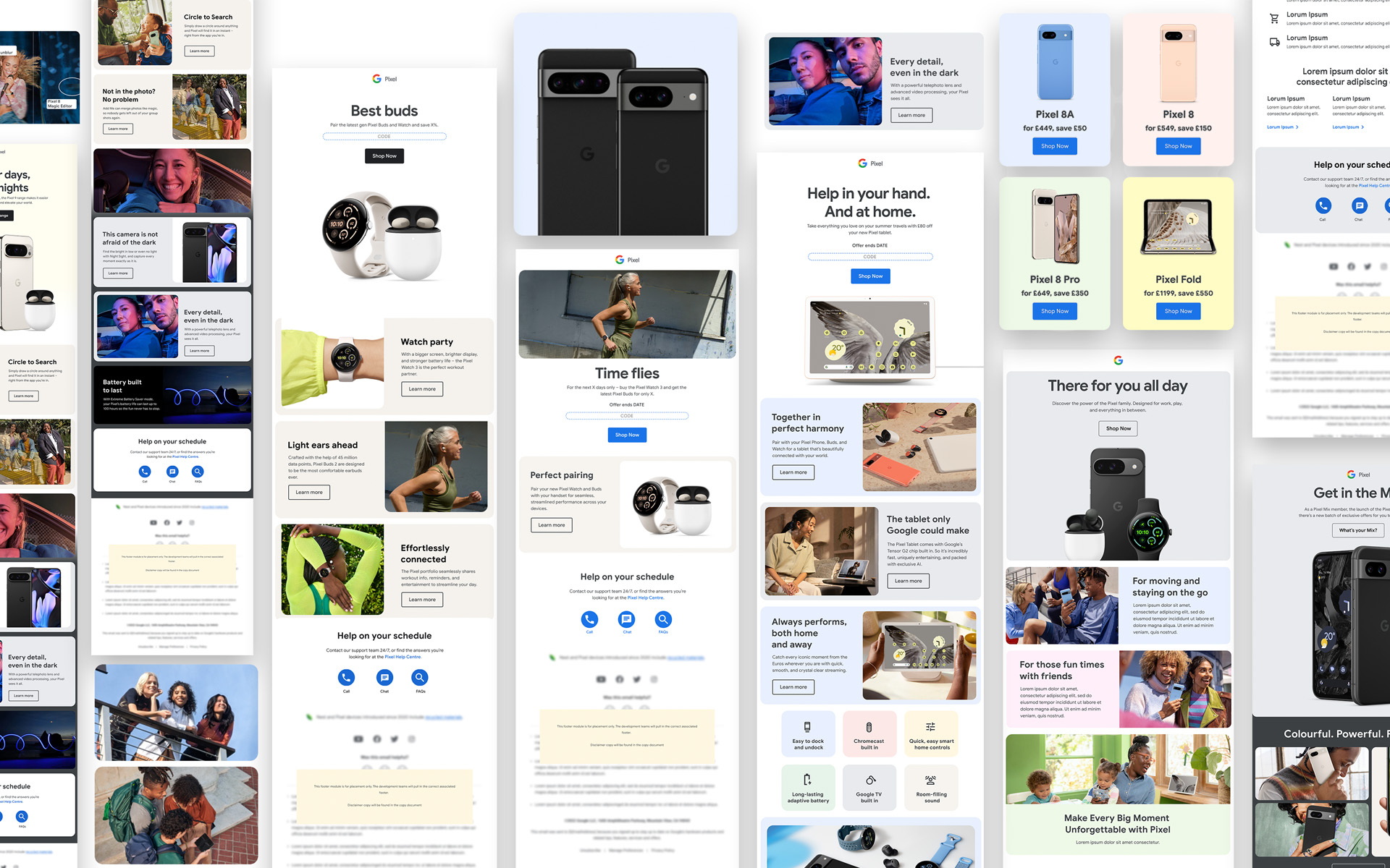
The programme covered a wide spread of send types, and they all came off the same set of components. Product education sends built around a single feature. Seasonal offer emails carrying discount codes and end dates. Device comparison grids stacking the range side by side with price and saving. Ecosystem sends showing the Pixel family working together. Welcome and portfolio comms for new customers.
Blocks were built to reorder and recombine so any of those could be assembled without rebuilding from scratch, with the colour blocking doing the structural work — soft blues, pinks, greens and yellows separating one product story from the next down a long scroll. Territories ran off the same framework, so a send could be adapted market to market without the layout being redrawn.
Beyond the phone.
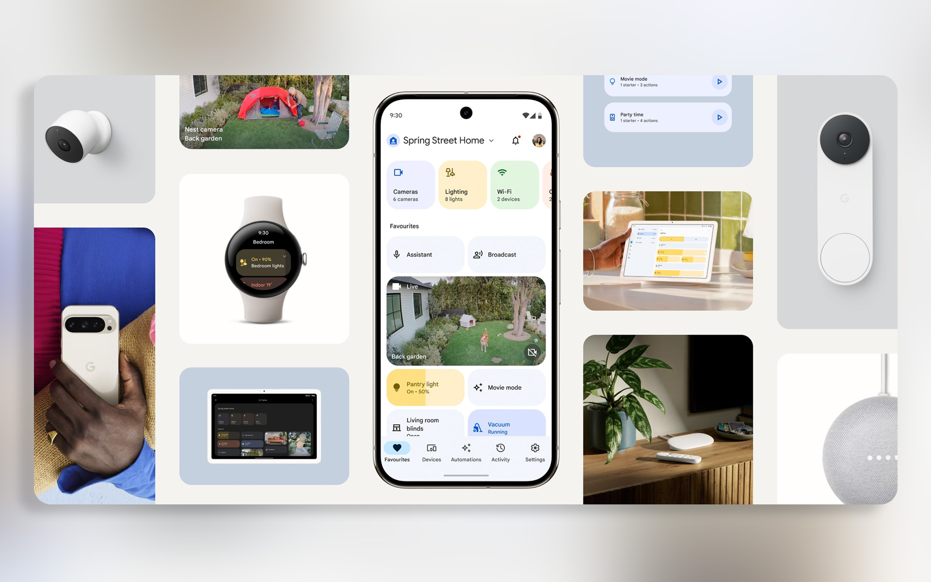
The Pixel phone was the entry point, but the programme's real subject was everything around it. Nest cameras, the doorbell, thermostats, speakers, Chromecast and Google TV, the Pixel Tablet as a home controller, the Watch as a remote for all of it.
Those sends had a different job to the launch work: less about a single device and more about the shape of a home that runs on one system. The layout carried that — device grids, room-level interface shots, automations shown as they'd actually appear on screen — making the ecosystem the argument rather than any individual product in it.