Activ8 Solar Energies · Commercial Rebrand · Senior Multimedia Designer
A premium identity for a different kind of customer.
☕ about a 2-minute read
One family, two audiences.
Activ8’s residential brand had to stay warm and approachable: homeowners, quick decisions, an emotional purchase. Commercial needed the opposite register: considered, credible, able to sit in a tender document next to competitors twice its size. Rather than a new logo, the fix layered a new palette and material language onto the same mark: deep black, a warmer gradient, and print stock that felt expensive to hold.
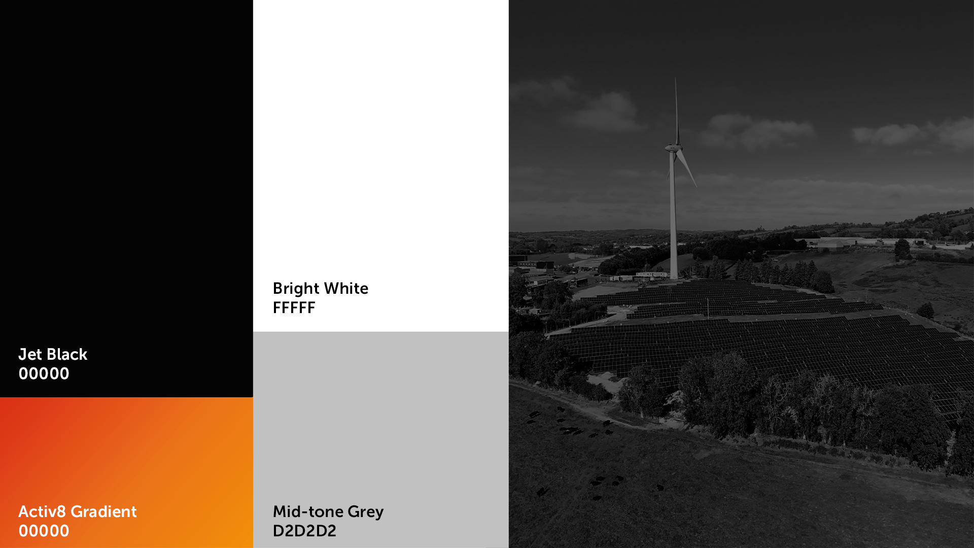
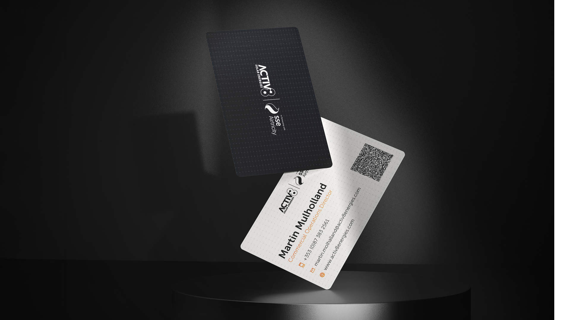
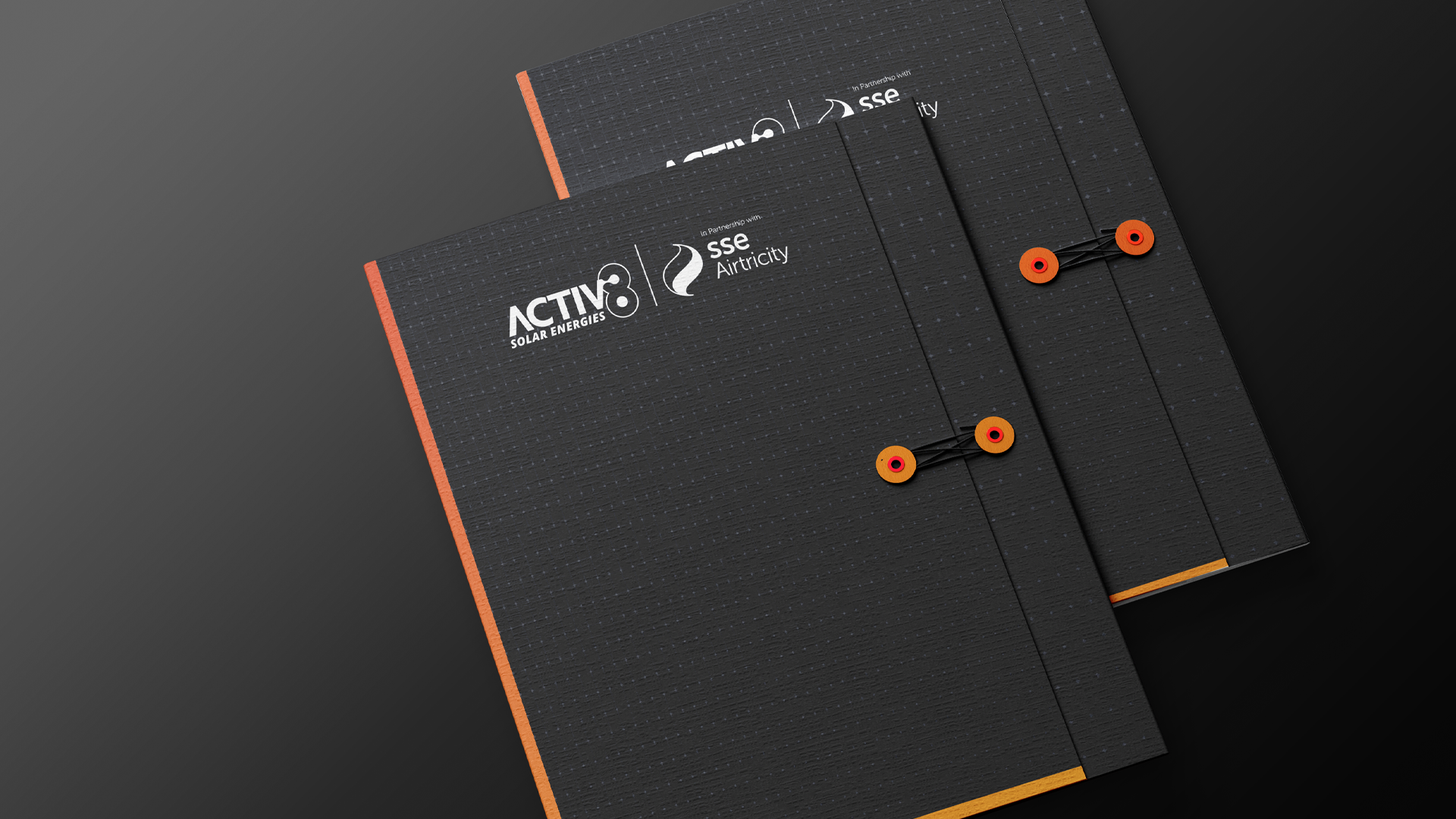
Built for procurement, not applause.
Commercial solar isn’t bought on impulse. It’s bought after a deck, a site visit, a proposal and a folder left behind in a boardroom. Every piece of collateral had to survive that scrutiny: a pitch deck built to sit next to partners like AIB and SSE Arena, and print finishing considered enough that the fastenings on a folder became part of the brand.
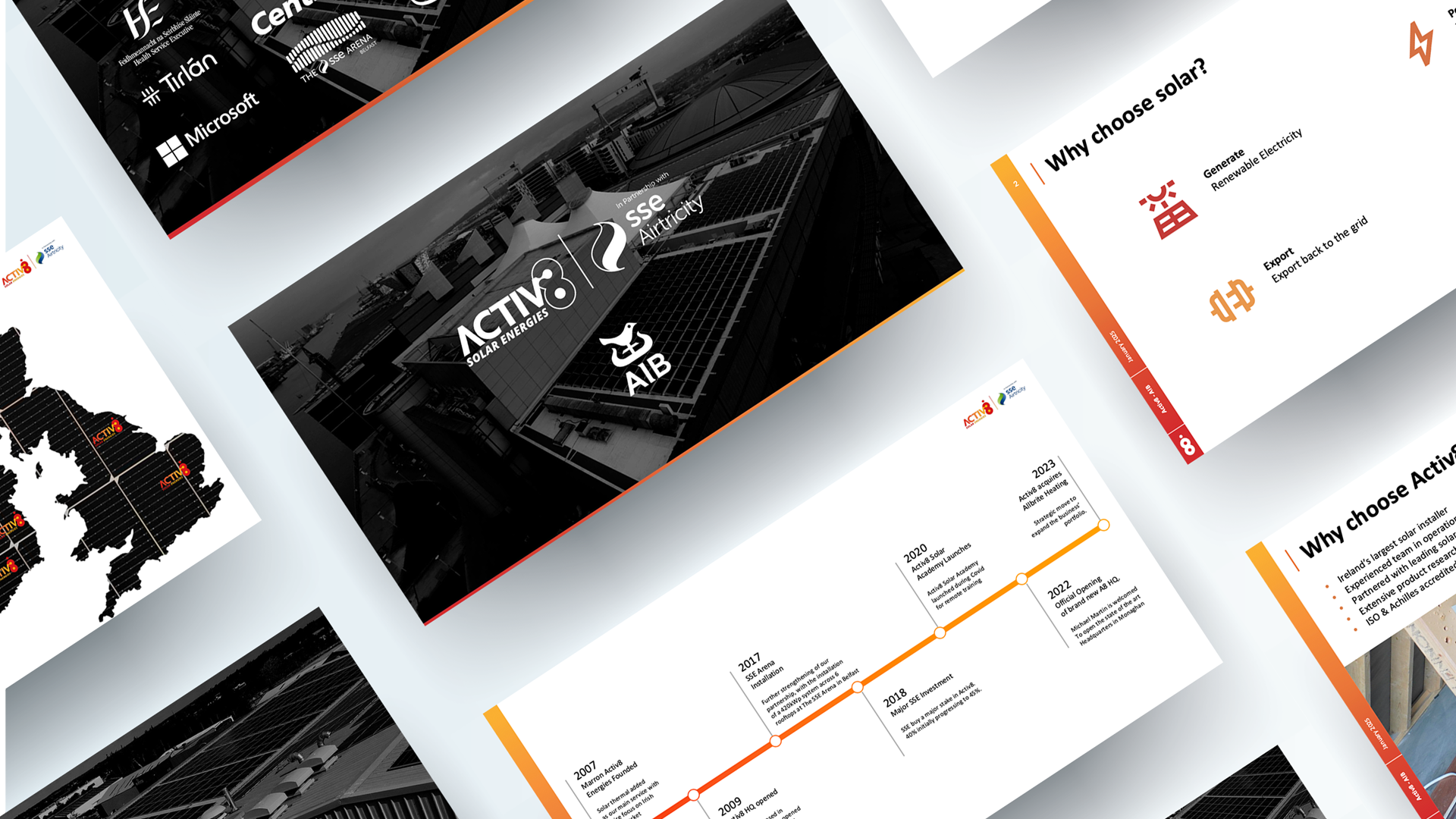
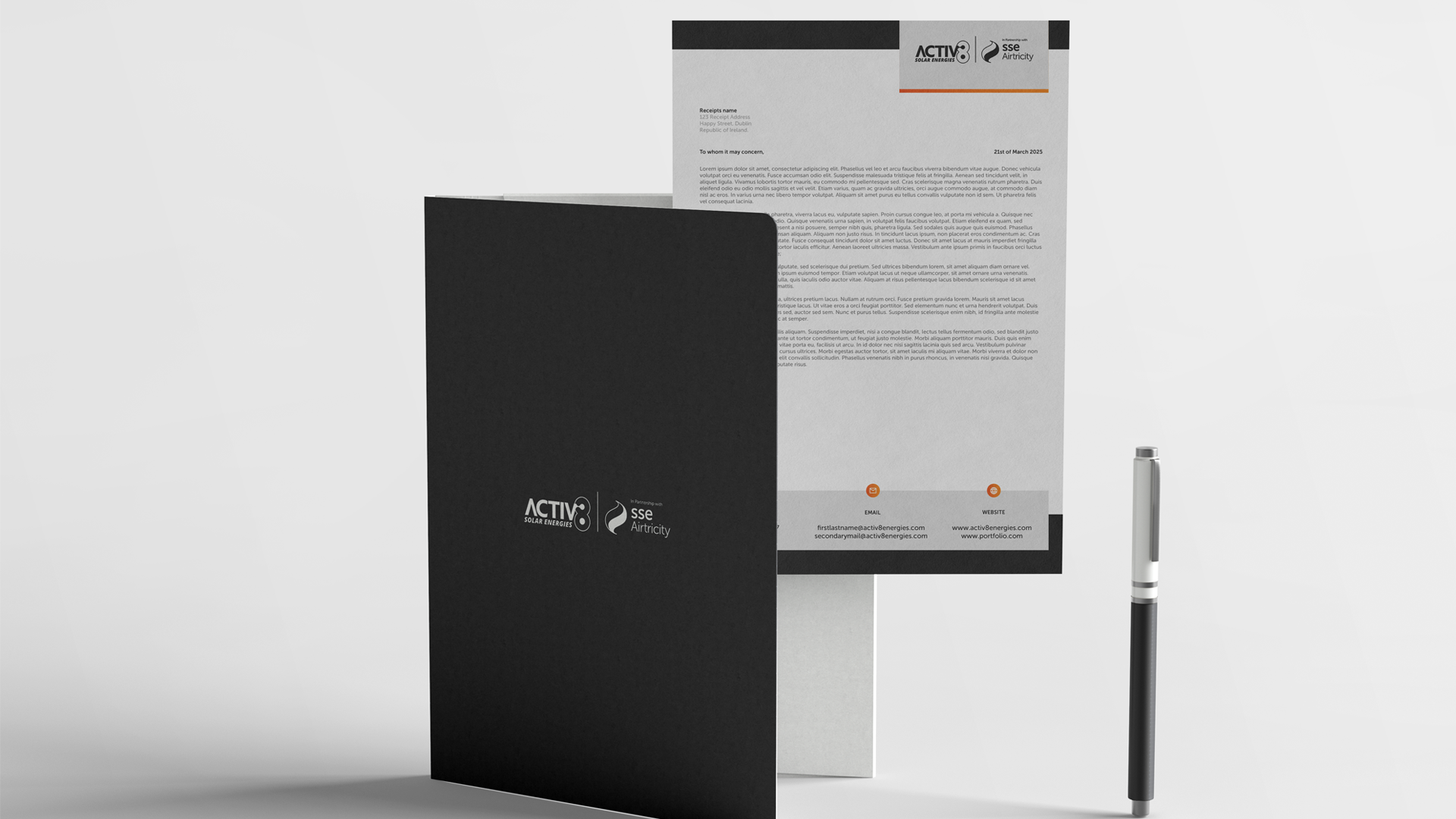
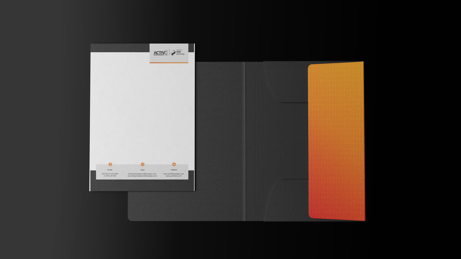
“Bespoke enough for a boardroom, familiar enough to still be Activ8.” ✳
A digital home under the same roof.
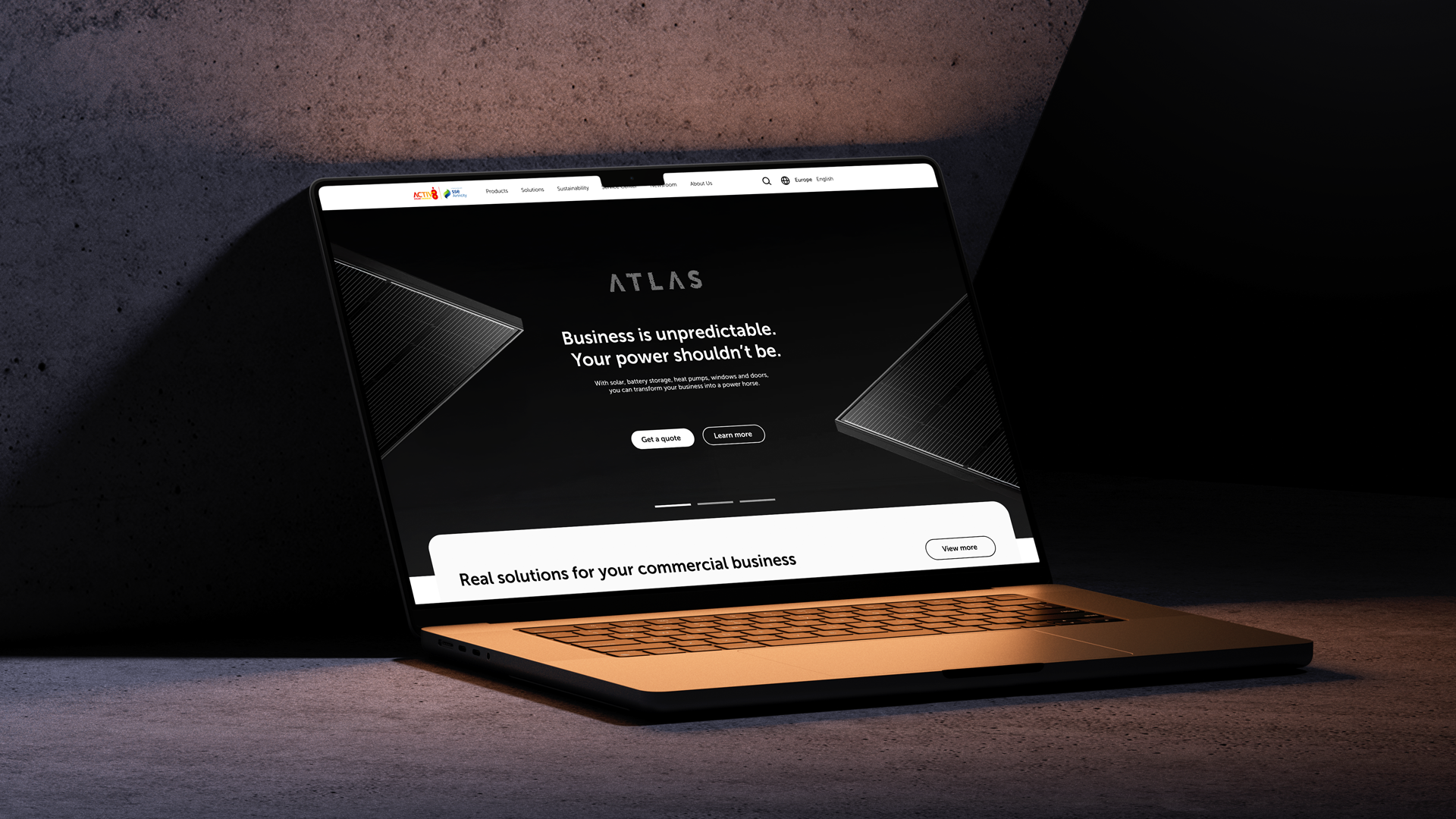
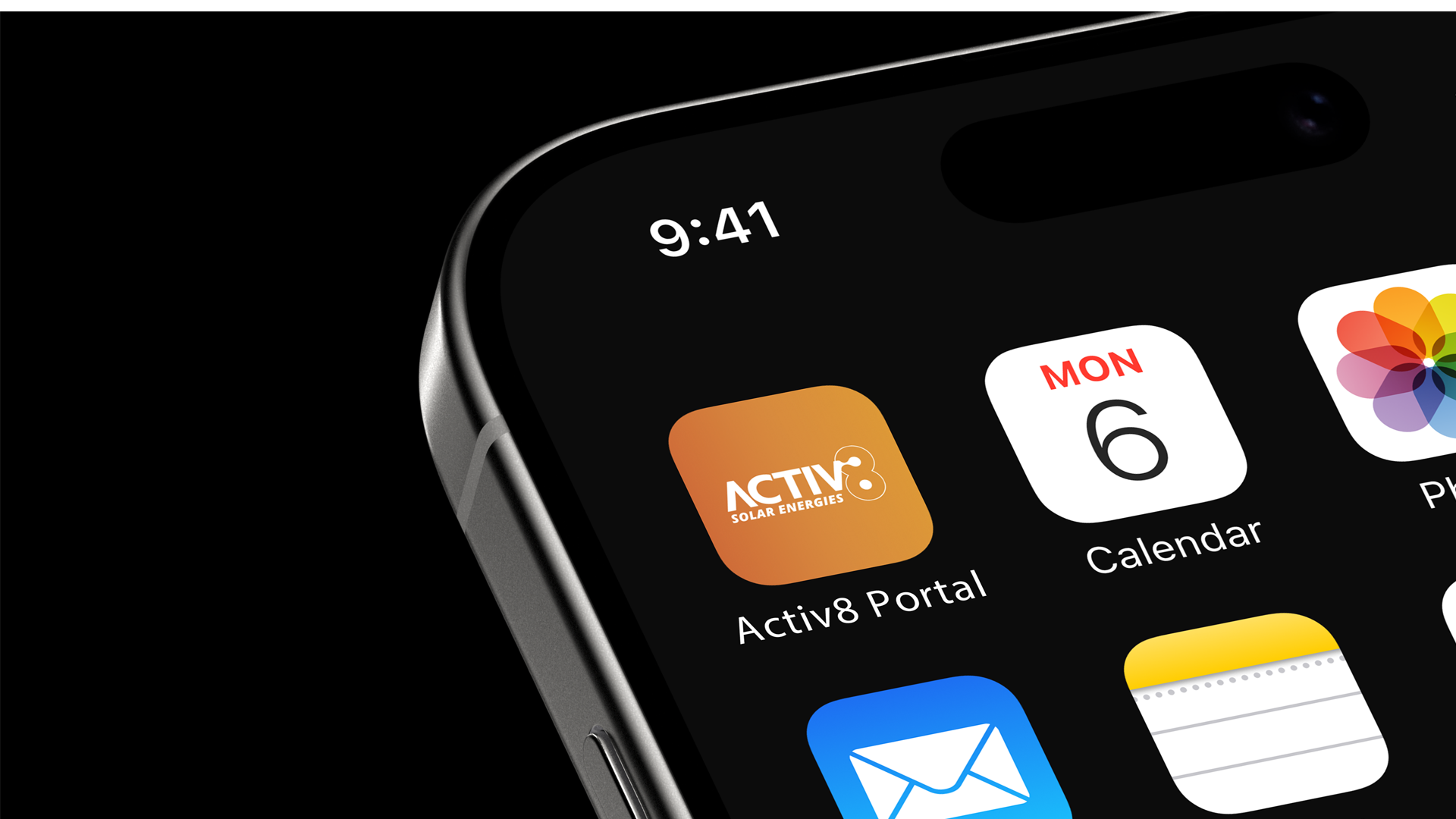
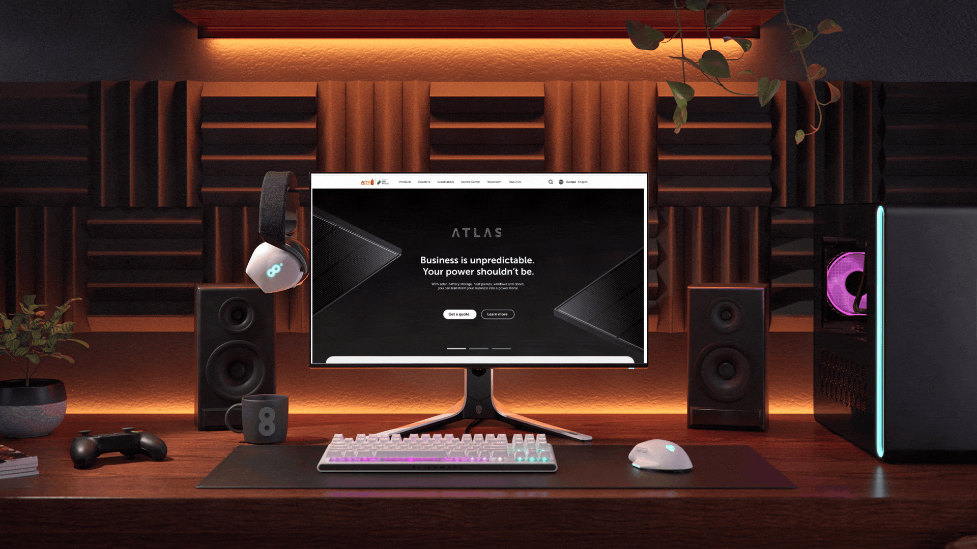
The commercial offer needed its own front door online: Atlas, a dedicated site for the storage, heat pump and solar propositions sold into businesses, sitting under the wider Activ8 domain and app ecosystem rather than standing apart on its own.
The identity people actually carry.
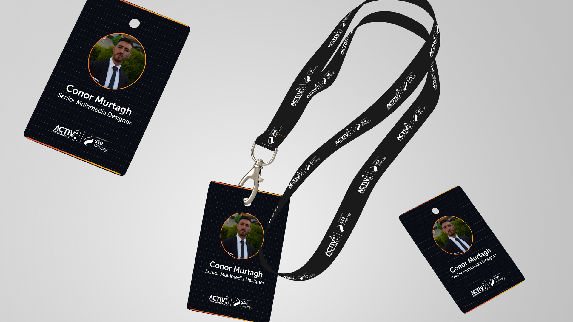
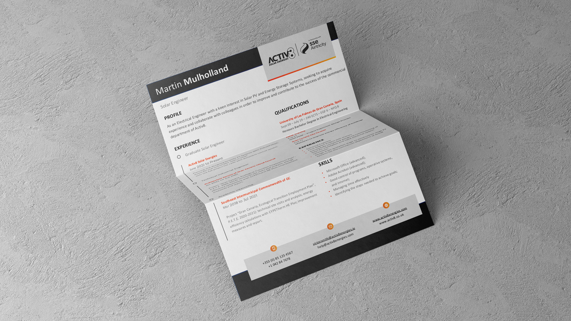
Away from the pitch, the same system had to hold up in the everyday: ID badges and lanyards for the team, a CV template for hiring, even the tab title in a browser. Small details like these are what make a brand feel real rather than assembled for the meeting.