Google Assistant · with leSHOP
Drawing the world Google talks to.
☕ about a 2-minute read
One cast, many scenes.
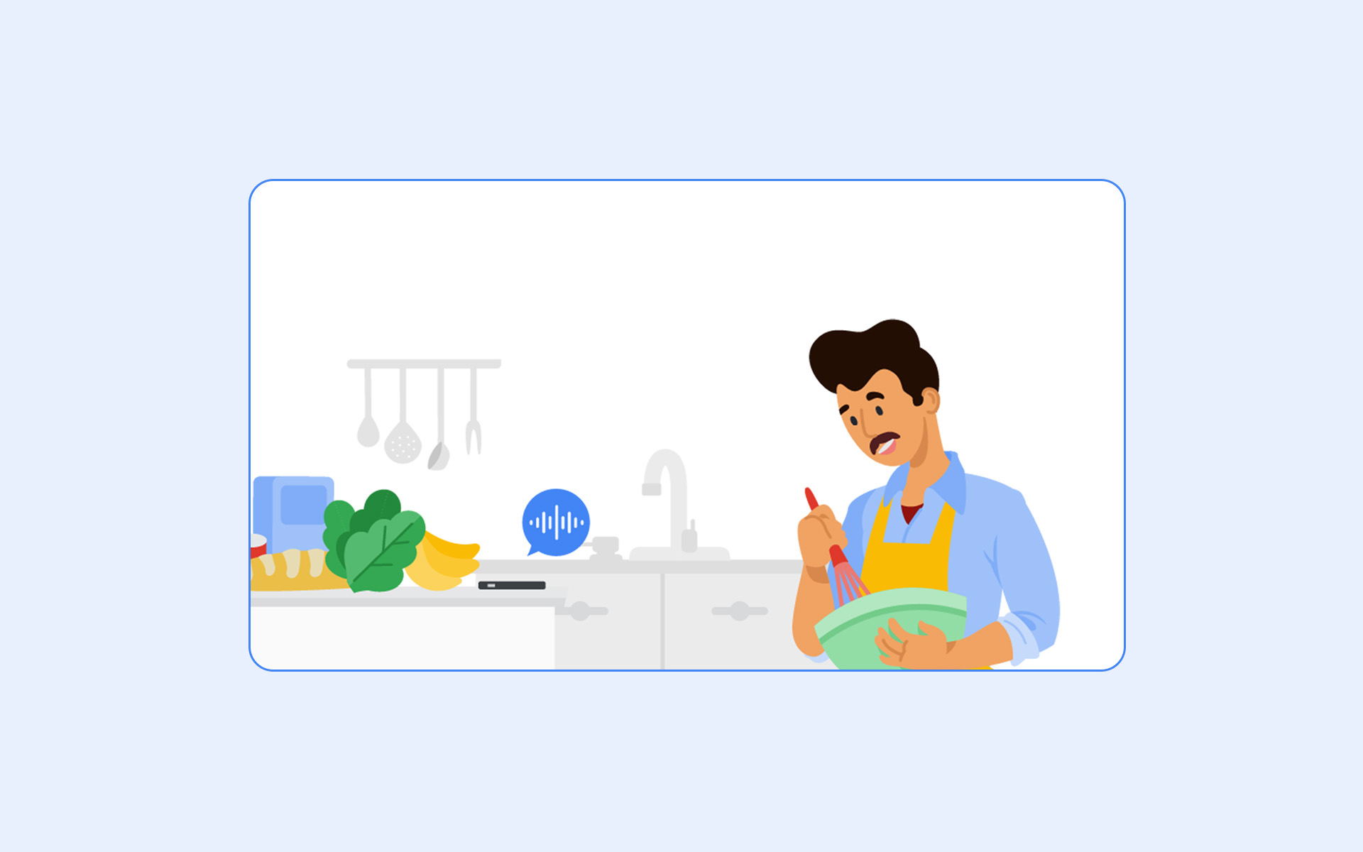
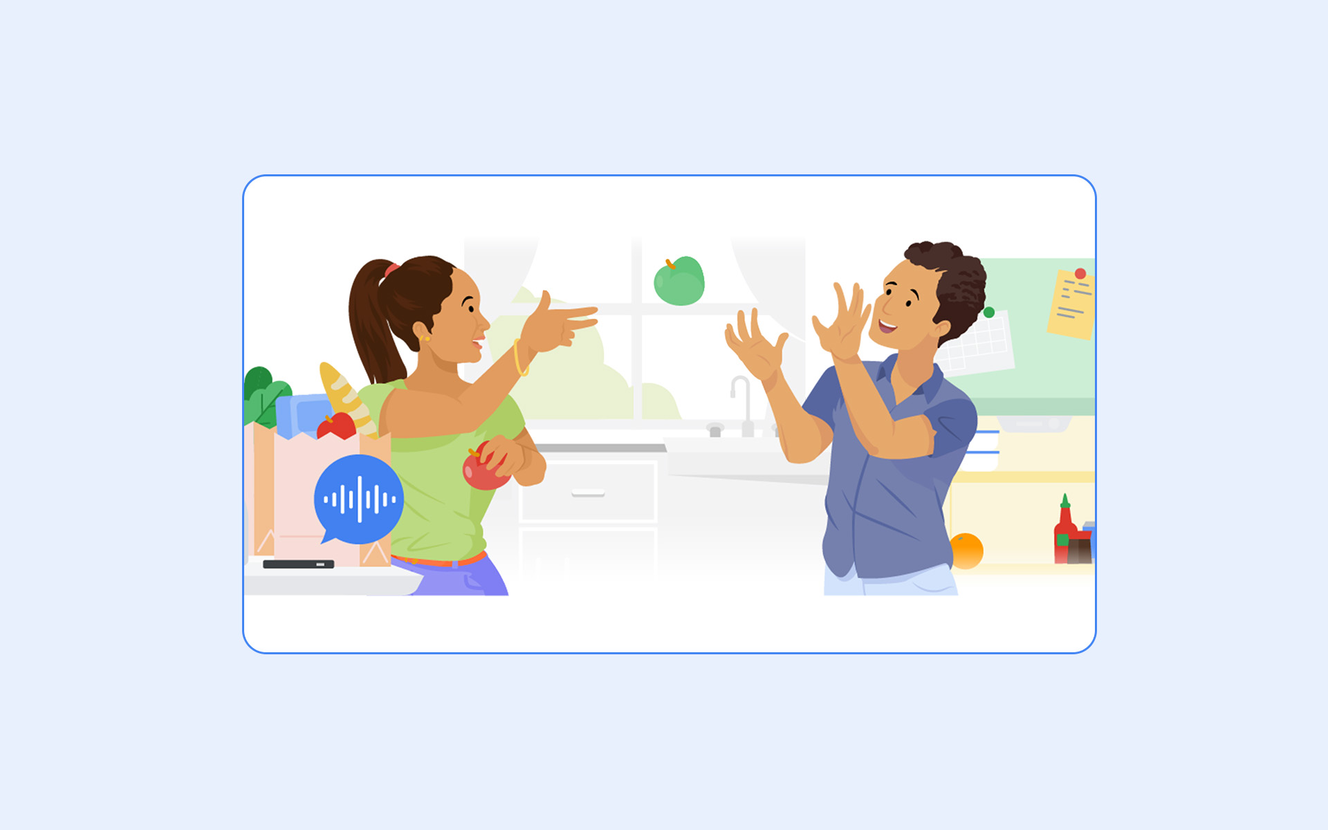
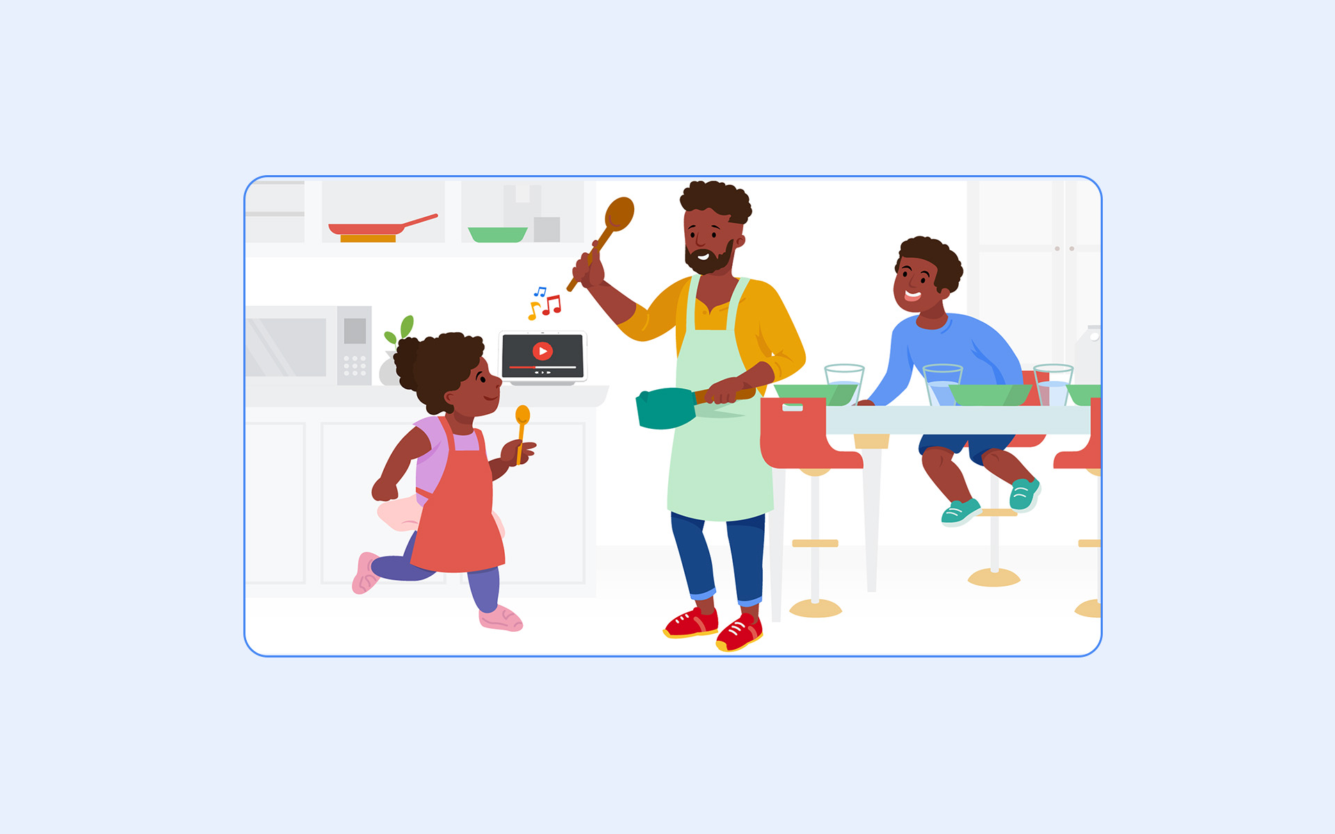
The illustrations needed to do double duty — warm and specific enough to feel human, simple enough to localize and resize without redrawing. A recurring visual language took shape: rounded figures, a limited warm palette, a consistent way of showing the Assistant itself as a small blue waveform rather than a literal device.
Scenes ranged from quiet domestic moments — cooking, tidying, getting ready for bed — to seasonal set pieces built around a market's own calendar, each one illustrated to carry a specific voice command as its punchline.
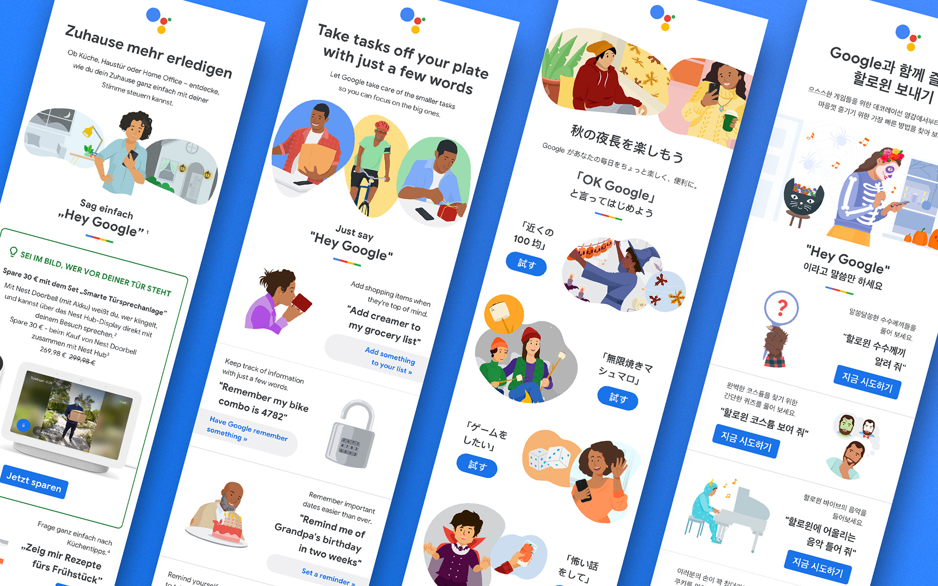
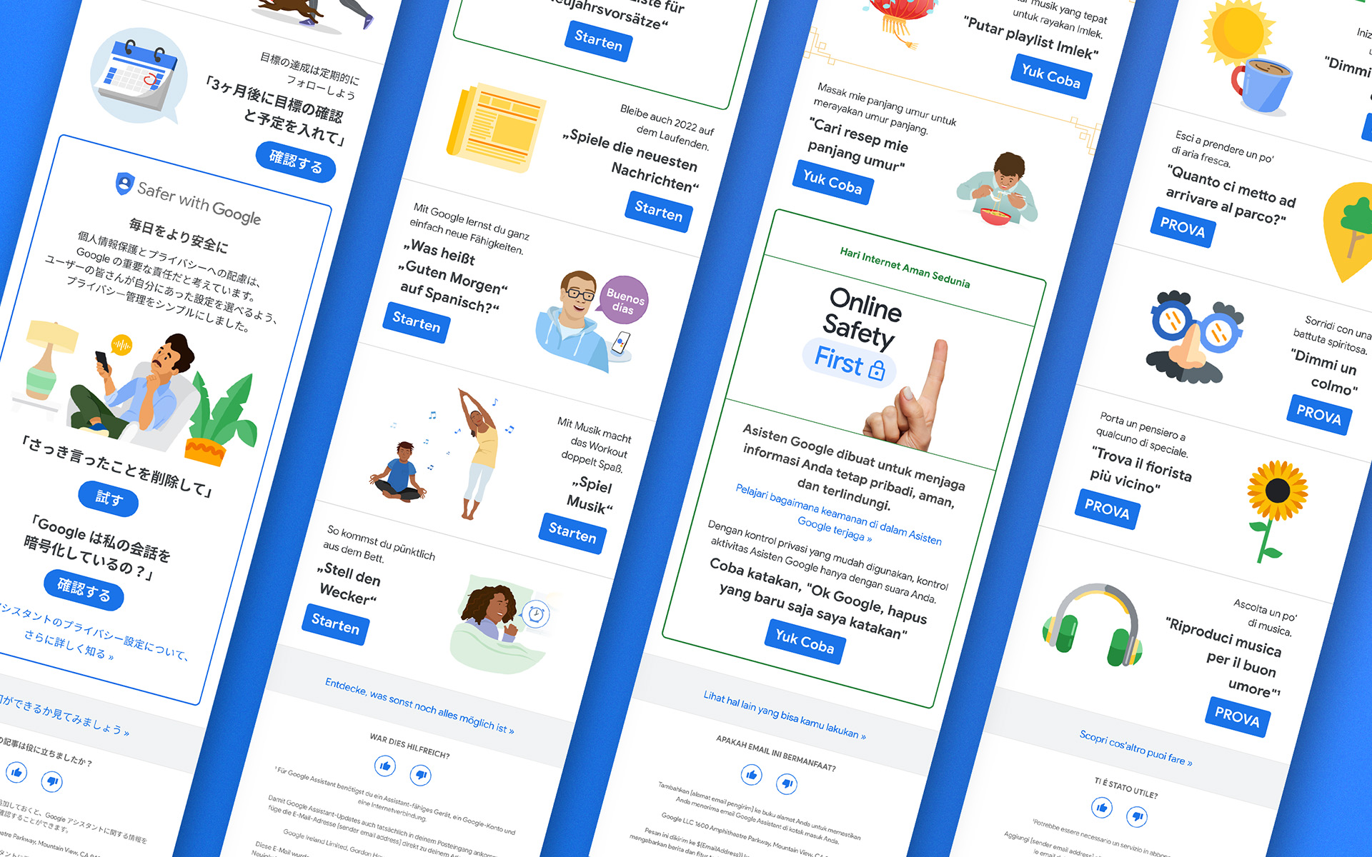
Built once, localized six times.
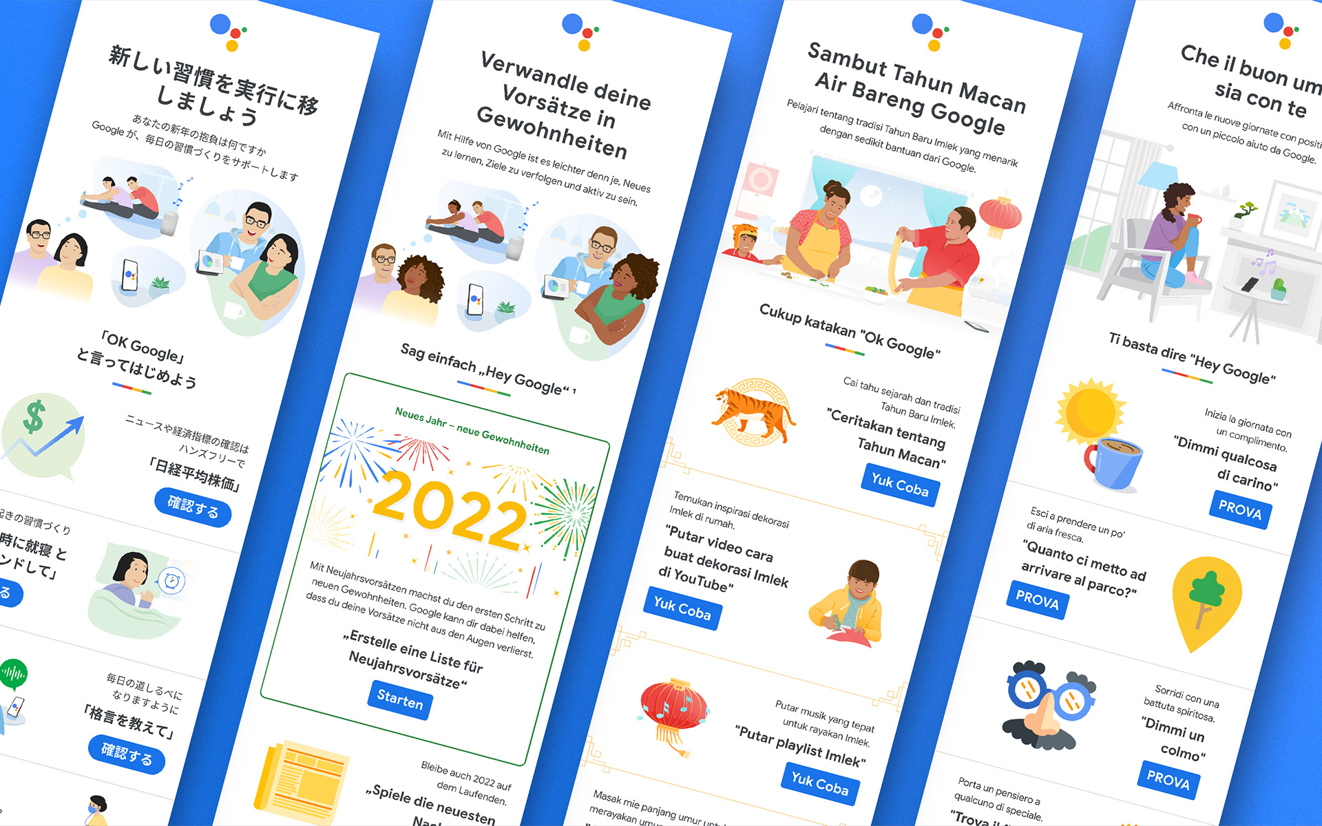
Every layout had to survive translation into six languages without the design breaking. German and Italian ran long; Japanese and Korean needed different type rhythm entirely; English carried the shortest copy of the set. The Figma build handled that with a modular structure — illustration, headline, voice-command callout and CTA as separate blocks that could resize independently.
Campaign themes ran the same system across very different moments: new year habit-building, home task automation, seasonal celebrations, and Google's Safer with Google messaging on privacy and online safety — four very different tones, one underlying framework.