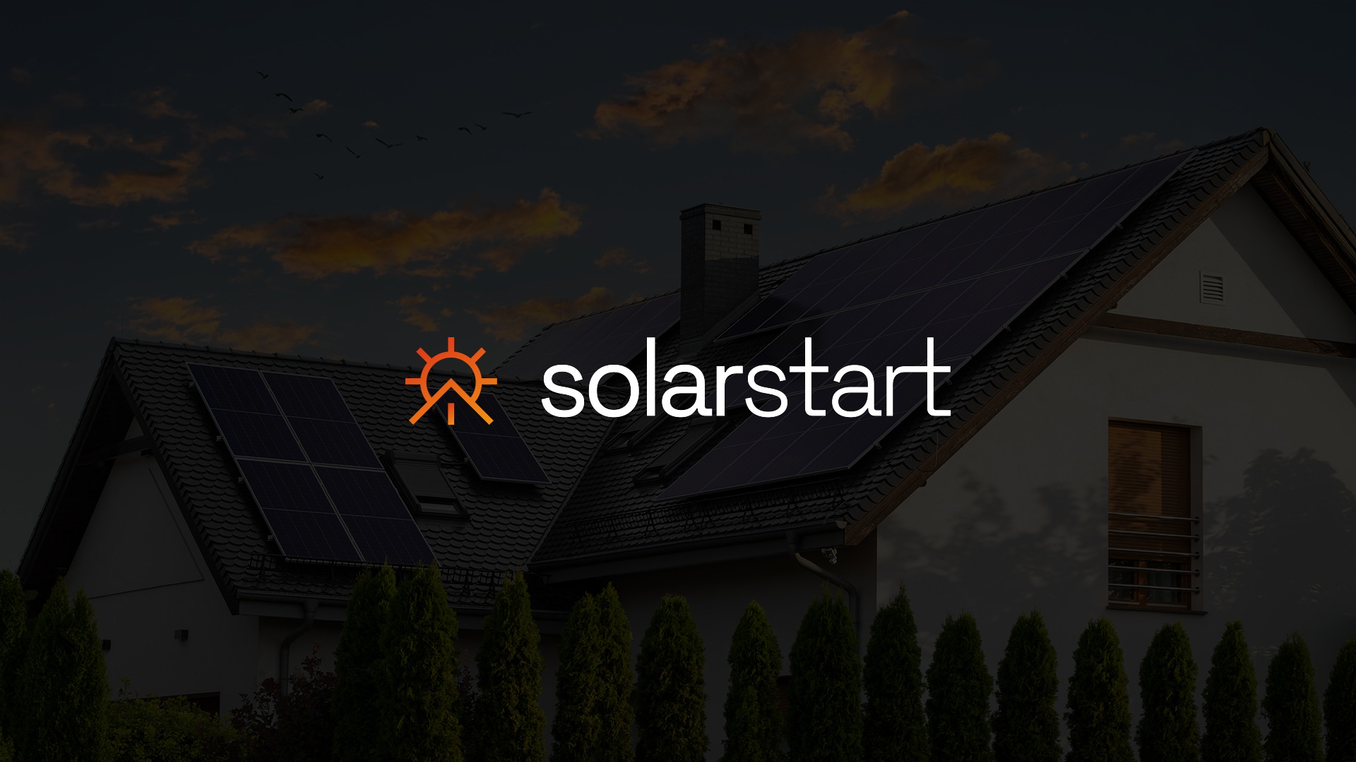
A house at dusk with solar panels on the roof, overlaid with the SolarStart wordmark and its sun-and-roofline mark in orange-to-amber gradient

SolarStart · Ique Studio

One mark, built to hold at any scale.

☕ about a 2-minute read

Overview

SolarStart is a solar energy company working across residential and commercial installs. The brief called for a full brand identity built around a single idea: a sun whose lower half resolves into a roofline, one symbol carrying both halves of the proposition, the energy, and the home it powers. An orange-to-amber gradient runs through the mark, echoing sunrise.

The identity was built to work everywhere before it was applied anywhere. Logo construction and clear-space rules, logotype spacing and colour across light and dark came first, so the same mark could hold at 32 pixels or across ten metres of hoarding without being redrawn. The system carries through the website, app icon and favicon, outdoor formats including hoarding, bus shelters, flags, utility box wraps and construction banners, and merchandise.

0
mark, carrying both the energy and the home it powers
0
pages of guidelines covering construction, spacing, colour and application
0
applications built on the same system, from favicon to construction hoarding

A sun that becomes a roofline.

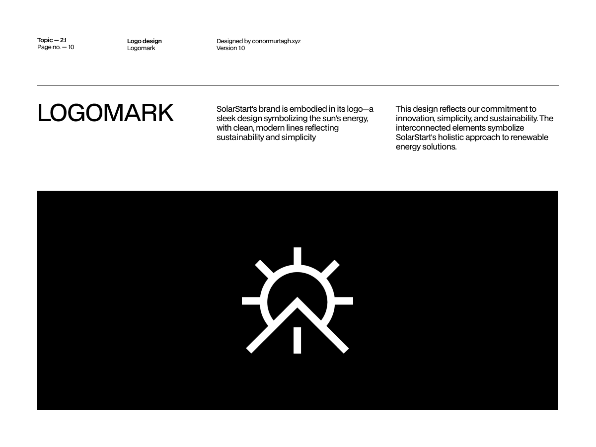
The mark reads two ways at once. Read it top-down and it’s a sun, rays radiating from a circle. Read the lower half on its own and it resolves into the pitch of a roof, the shape a house makes against the sky. One symbol carries both halves of what SolarStart sells: the energy, and the home it powers.
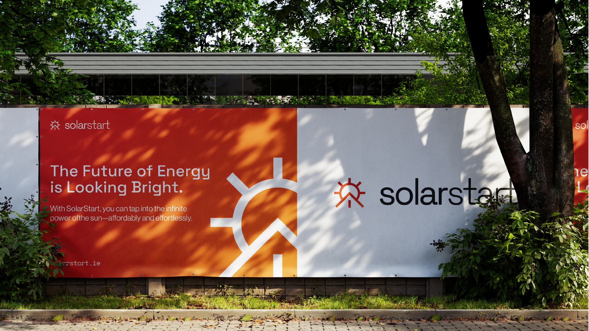
Construction-hoarding mockup split into an orange panel reading 'The Future of Energy is Looking Bright' and a white panel with the solarstart wordmark and mark
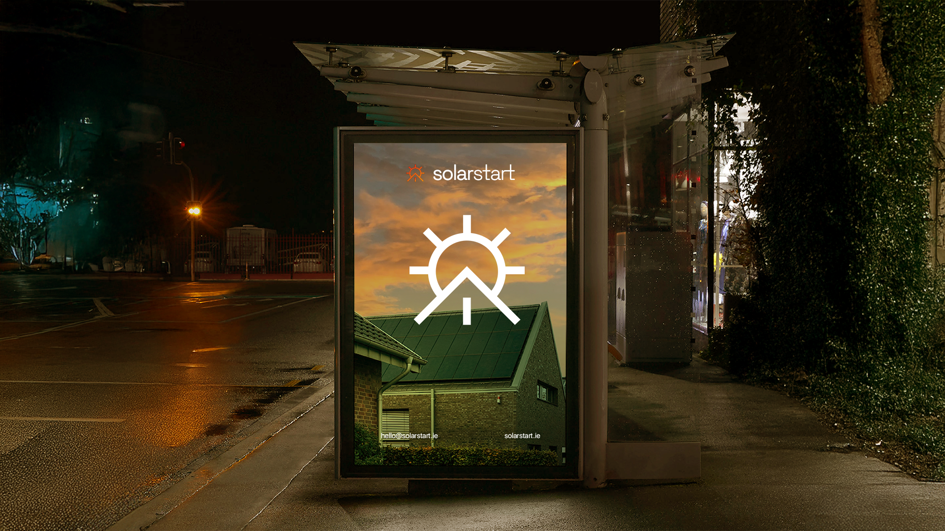
Illuminated bus shelter ad at night showing the solarstart wordmark and a large white sun-and-roofline mark over a dusk photo of a solar-panelled house
Four flags against a blue sky, alternating orange and black, each carrying the solarstart wordmark and mark

The grid came before the logo.

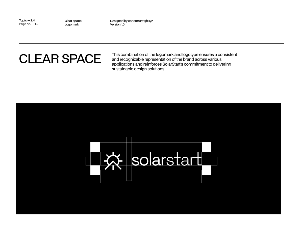
Every proportion in the mark sits on a construction grid: the ray length, the circle diameter, the angle of the roofline, all defined in relation to each other before a single application was designed. Clear-space rules and logotype spacing followed from the same grid. That discipline is why the mark holds at 32 pixels in a browser tab and at ten metres on a hoarding without ever being redrawn by hand.
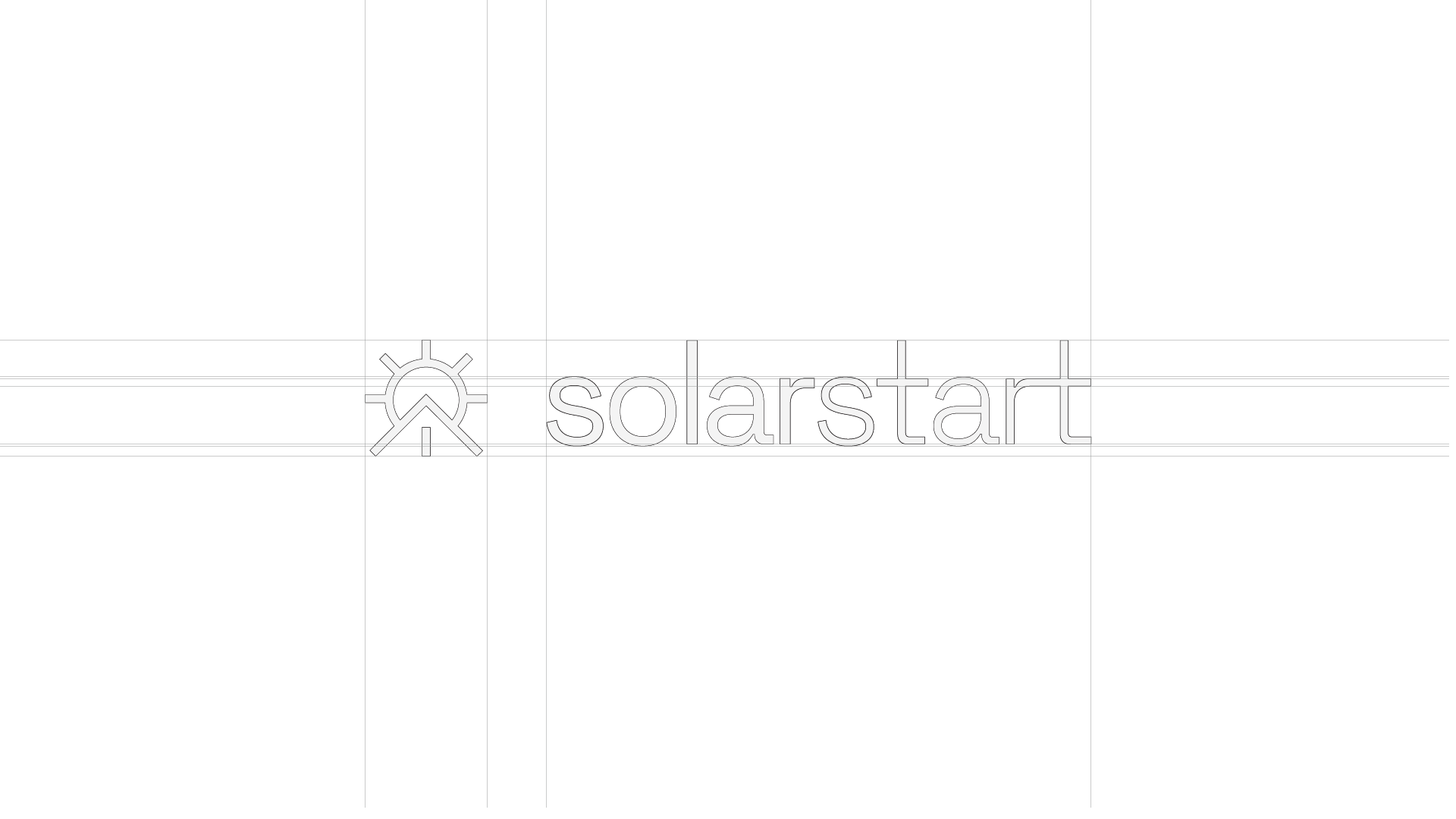

Construction-grid diagram showing the full solarstart logo lockup built on an underlying column and baseline grid
Construction-grid diagram showing the sun-and-roofline mark alone, built on intersecting grid lines and diagonals
The finished solarstart logo lockup, mark and wordmark, on a plain white background
“Half sun, half roofline. One mark for the whole idea.”

Colour that holds in light and dark.

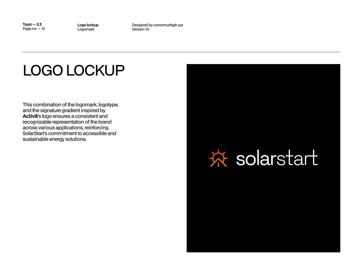
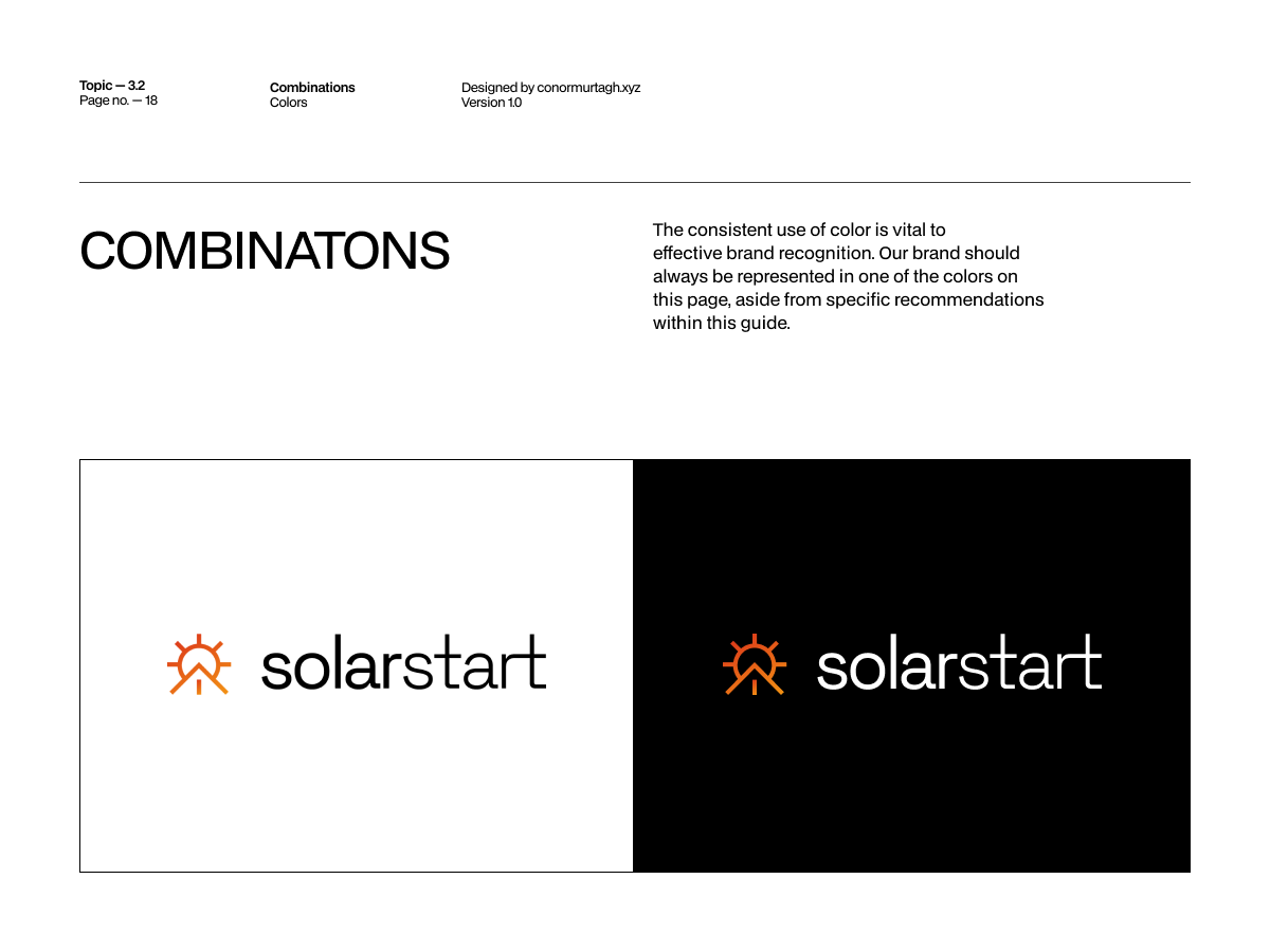
The orange-to-amber gradient was built to survive reversal: white on black, full colour on white, a single-colour cut for merchandise and signage where gradients don’t print. The same rules carried the mark down to app icon and favicon scale, where it still reads at a glance instead of collapsing into a smear.
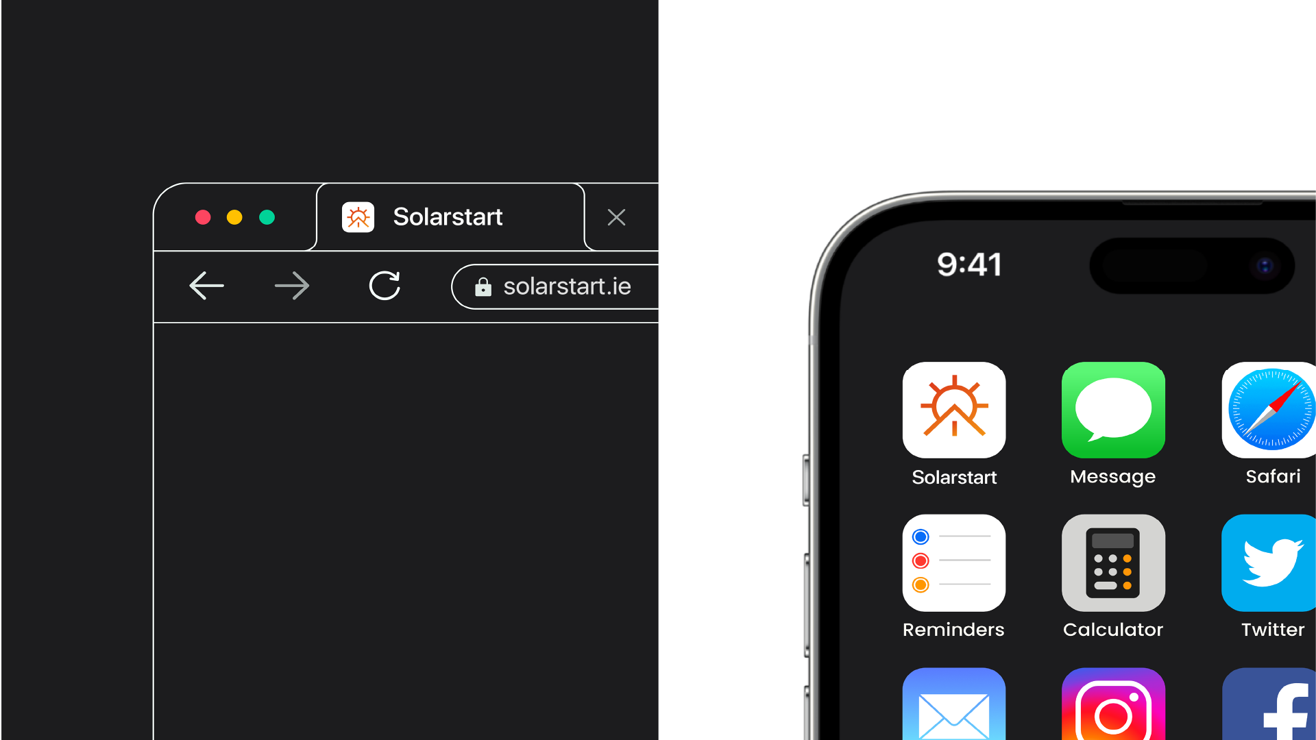

A dark browser tab showing the solarstart favicon and solarstart.ie address bar, beside an iPhone home screen with the SolarStart app icon among other apps
The sun-and-roofline mark in full orange-to-amber gradient on a white background
The sun-and-roofline mark reversed in gradient on a black background

Built for the street, not just the screen.

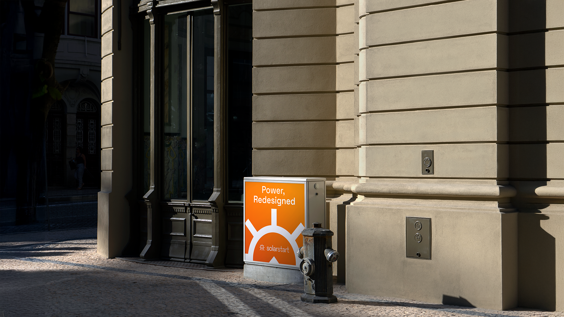
Outdoor was never an afterthought: hoarding, bus shelters, flags, utility box wraps and construction site banners all run on the same grid and colour rules as the website and app icon. A system built for a business card has to survive being seen from a moving car, and the SolarStart mark was built to do both from the start.
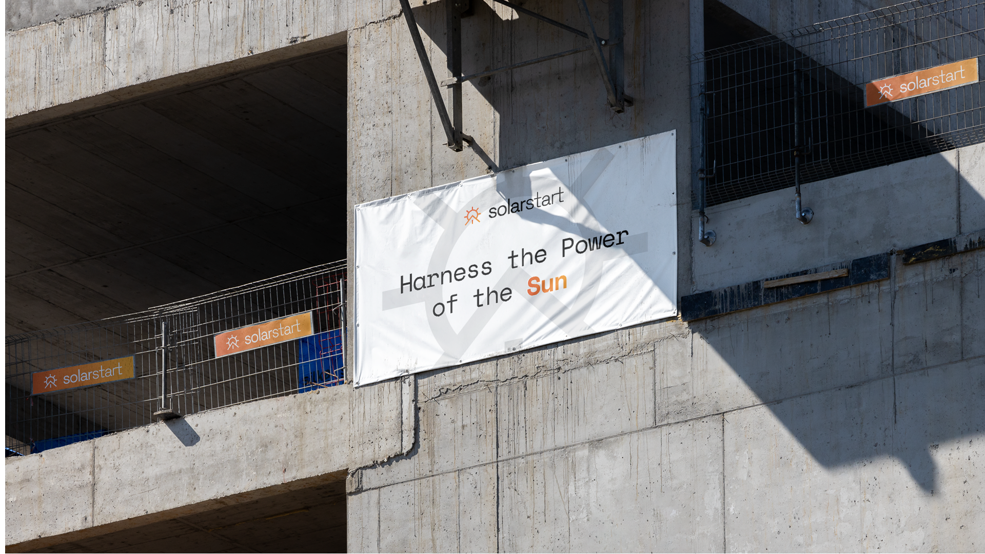
A construction-site banner reading 'Harness the Power of the Sun' mounted on a concrete building under construction, with smaller solarstart tags visible on scaffolding netting nearby
A street utility box wrapped in an orange gradient panel reading 'Power, Redesigned' with the solarstart mark, set against a stone building facade
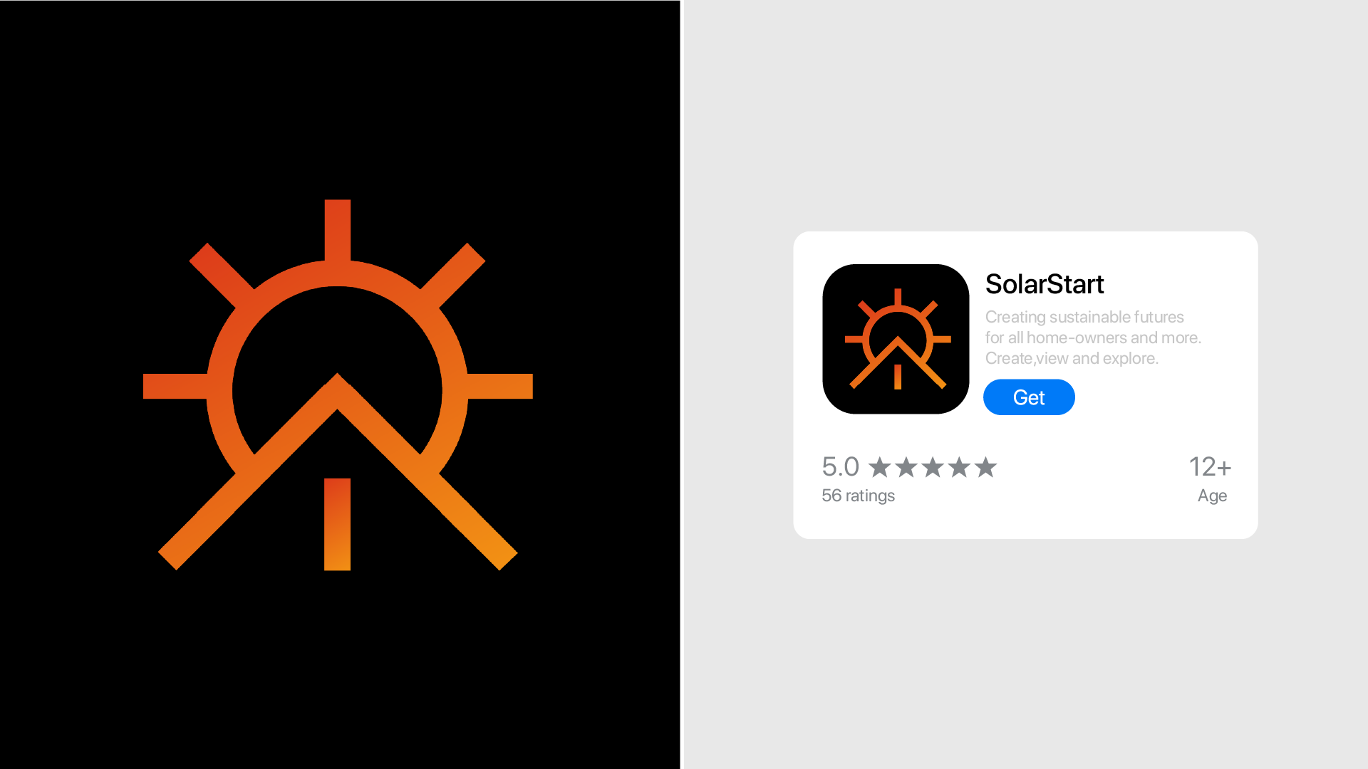
A black rounded-square SolarStart app icon beside an App Store listing card showing a 5.0 rating and a Get button
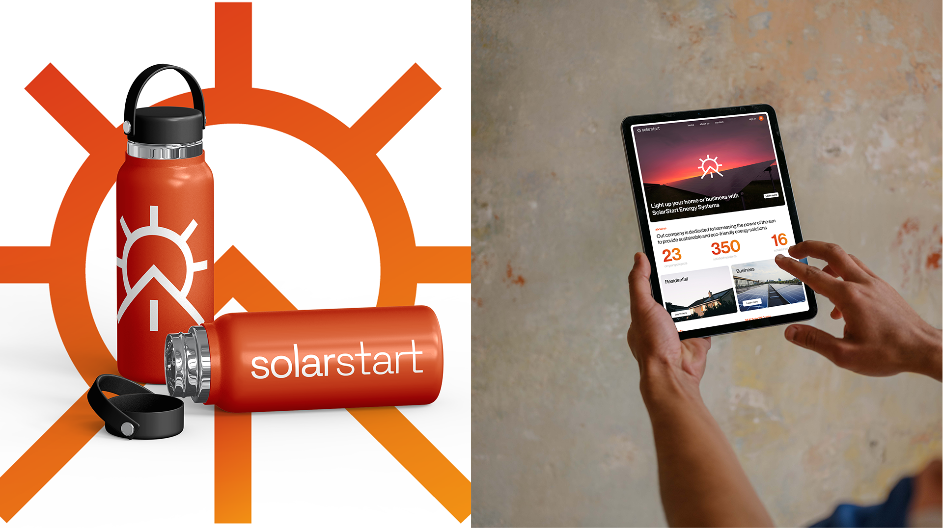
An orange water bottle printed with the solarstart mark and wordmark, beside a tablet showing the SolarStart website with residential and business sections

The manual behind the identity.

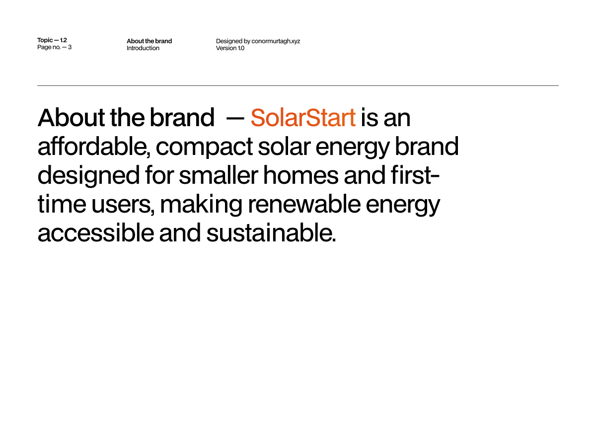
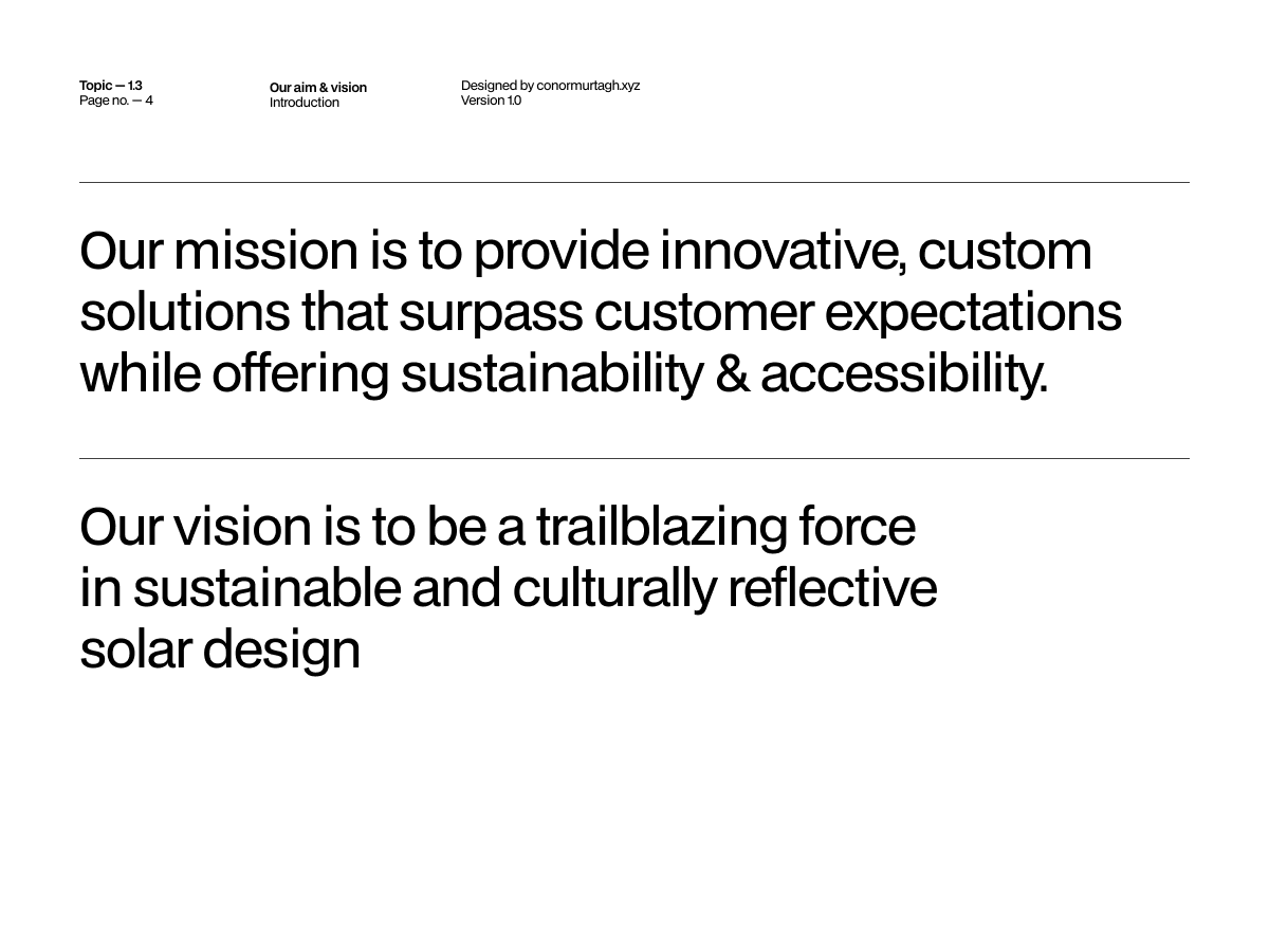
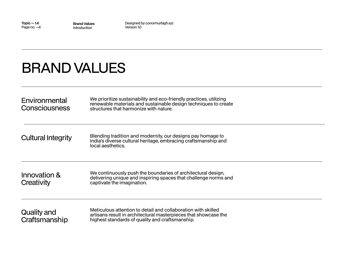
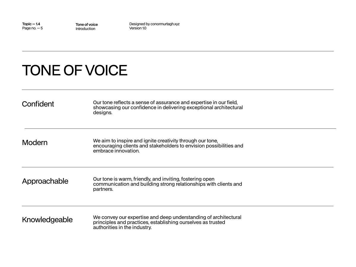
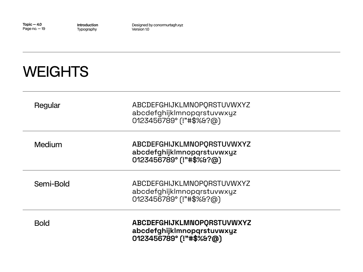
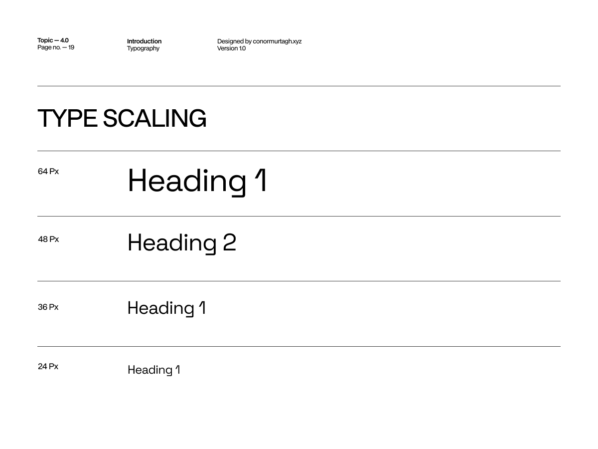
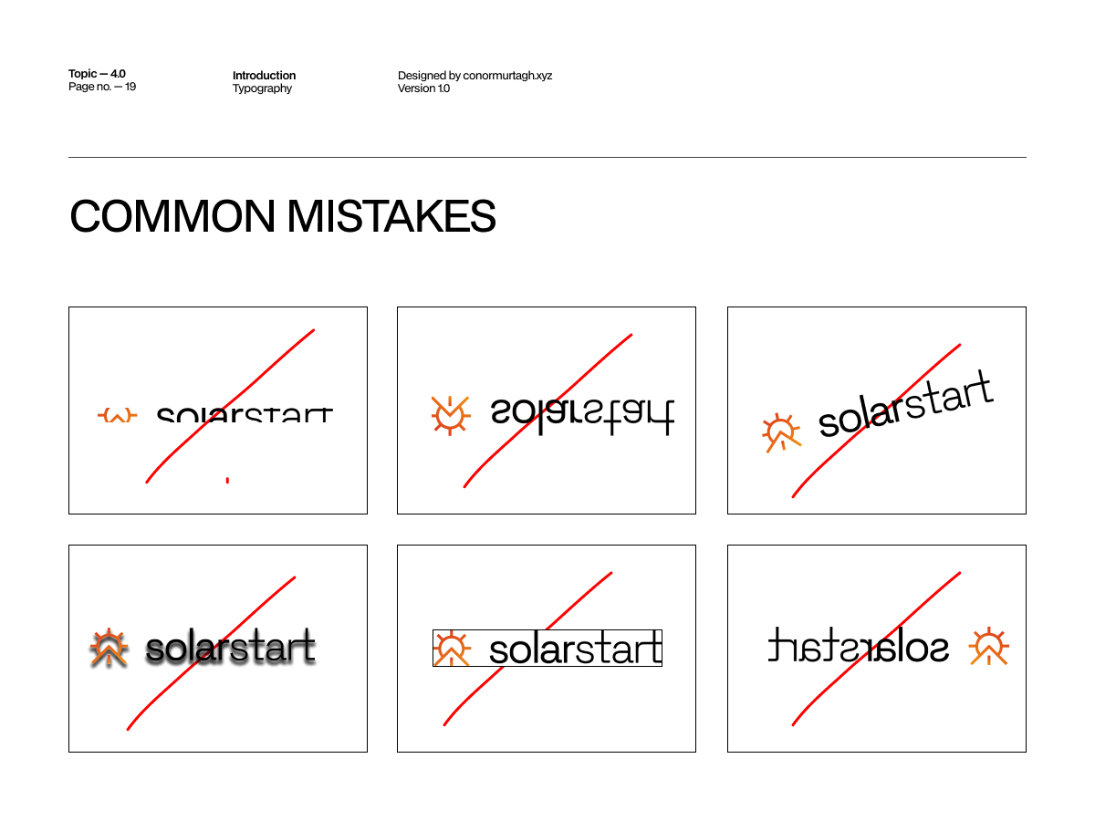
Twenty-three pages carry the system from here: construction, clear space, typography, colour and the common mistakes to avoid. The rules that let someone else apply the brand correctly without me in the room.
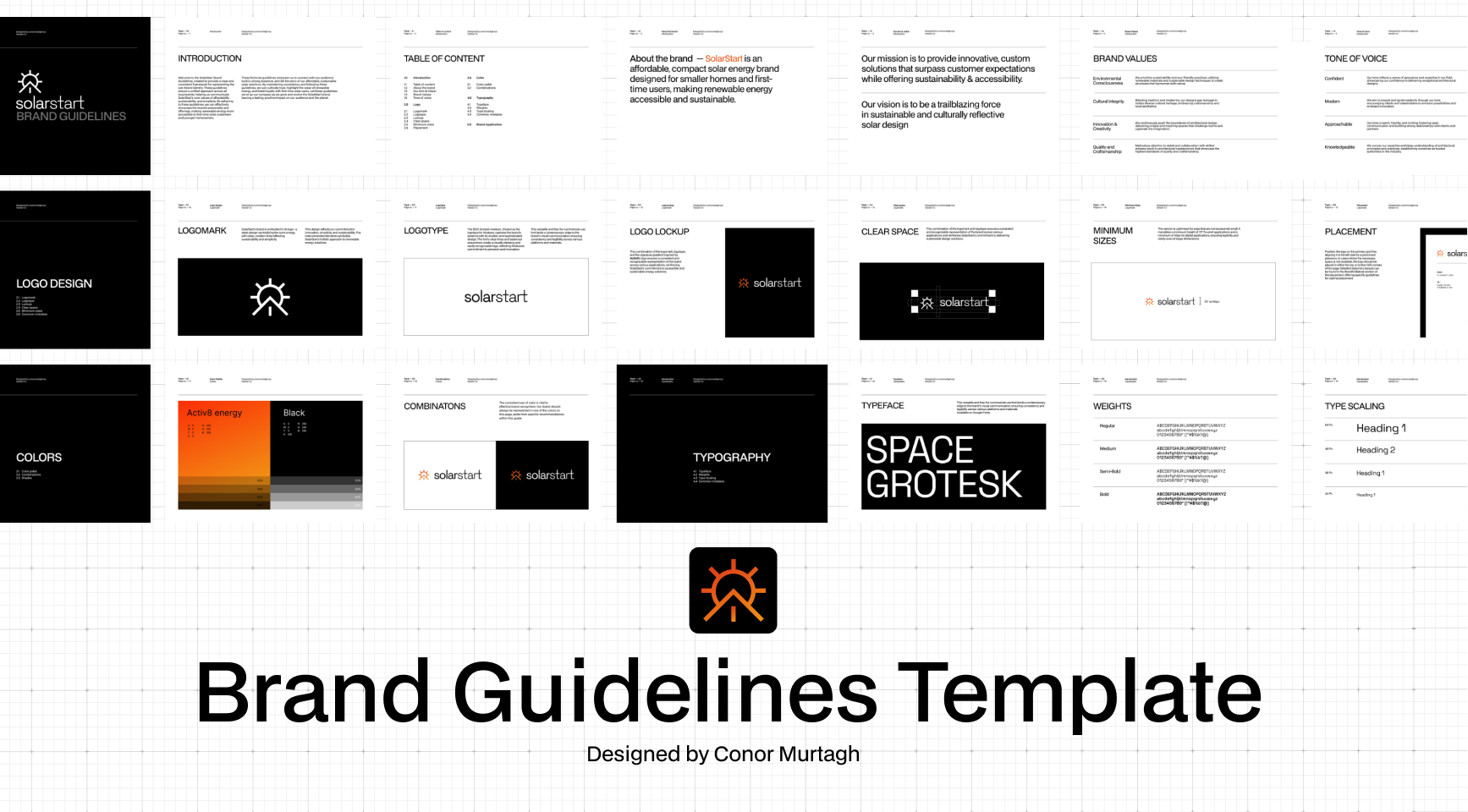
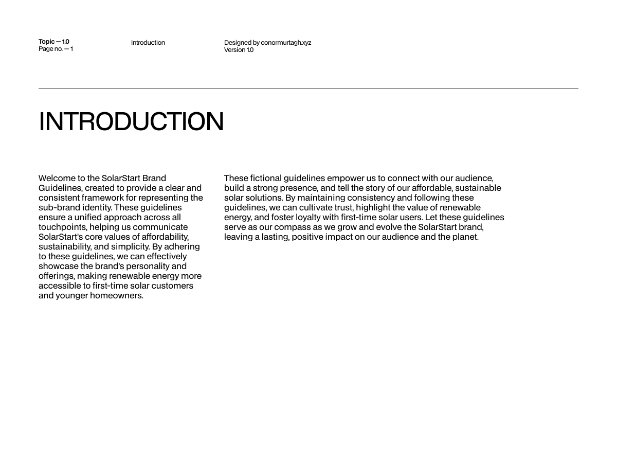
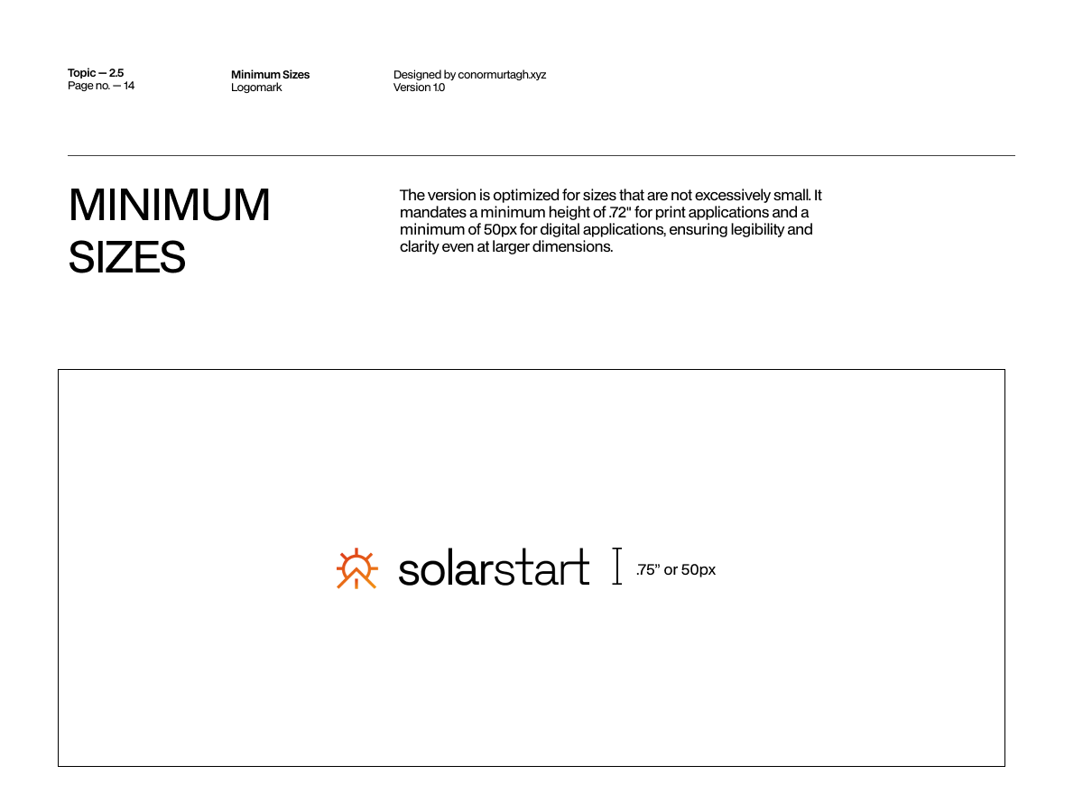
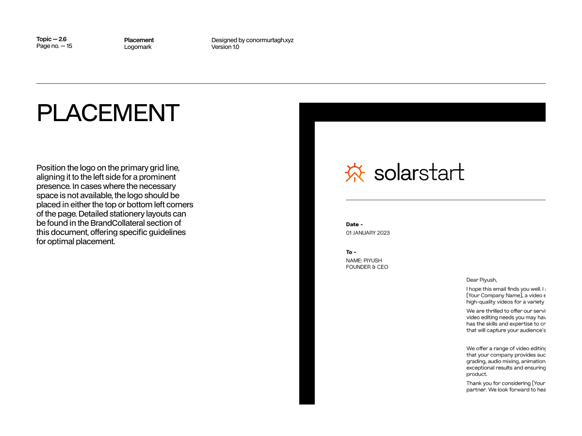
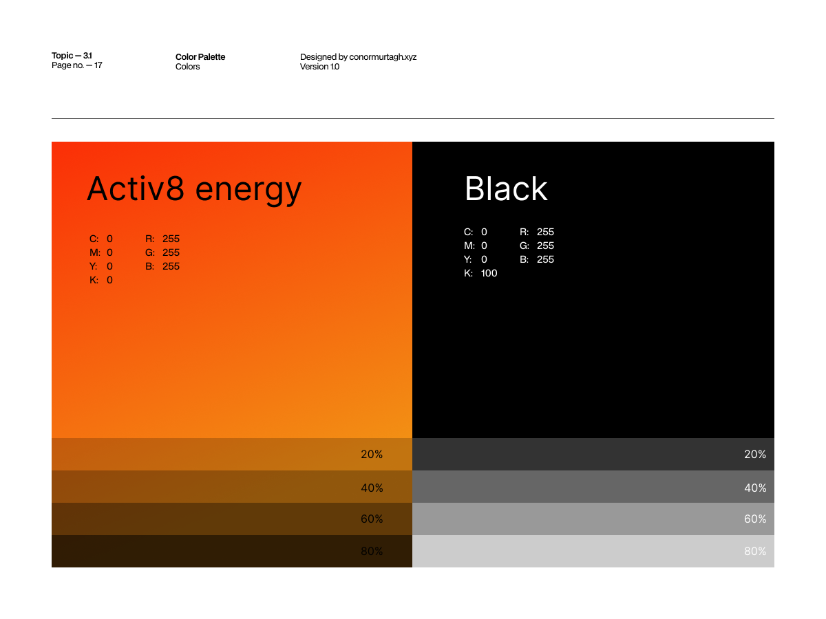
SolarStart brand guidelines, spread 1 of 23
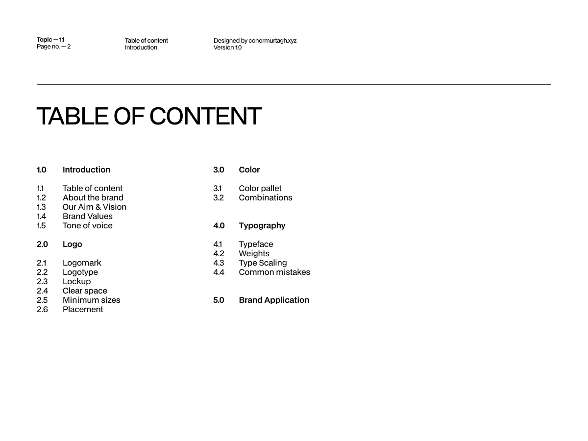
SolarStart brand guidelines, spread 2 of 23
SolarStart brand guidelines, spread 3 of 23
SolarStart brand guidelines, spread 4 of 23
SolarStart brand guidelines, spread 5 of 23
SolarStart brand guidelines, spread 6 of 23
SolarStart brand guidelines, spread 7 of 23
SolarStart brand guidelines, spread 8 of 23
SolarStart brand guidelines, spread 9 of 23
SolarStart brand guidelines, spread 10 of 23
SolarStart brand guidelines, spread 11 of 23
SolarStart brand guidelines, spread 12 of 23
SolarStart brand guidelines, spread 13 of 23
SolarStart brand guidelines, spread 14 of 23
SolarStart brand guidelines, spread 15 of 23
SolarStart brand guidelines, spread 16 of 23
SolarStart brand guidelines, spread 17 of 23
SolarStart brand guidelines, spread 18 of 23
SolarStart brand guidelines, spread 19 of 23
SolarStart brand guidelines, spread 20 of 23
SolarStart brand guidelines, spread 21 of 23
SolarStart brand guidelines, spread 22 of 23
SolarStart brand guidelines, spread 23 of 23

← drag or scroll to browse all 23 pages →